

Bernard Matthews has unveiled a new look logo as part of a major overhaul of its brand and range.
The turkey producer has replaced the old red-ribbon swirl with a more earthy logo in a bid to reflect its roots as a farming entity. Product packaging will also include a similar design and colour scheme.
The new corporate identity will begin rollout across all the company’s products from September, and will initially be on the cooked meats. Fresh meal-centre products will follow in October, with frozen lines converted by January.
The company is also introducing a new range under the Big Tick brand and relaunching its cooked meats business.
The new ‘Big Tick’ brand, which is launched next month, is aimed at ticking all the boxes that consumers want to see in products, including low in saturated fat, 100%-British turkey breast meat, good price and healthy ingredients.
In the cooked meats business, Bernard Matthews will streamline its product range from 50 SKUs to 30 in a bid to reduce duplication and gain more control in the category.
The initiatives, which will be backed by a £3m consumer advertising spend, were the latest planks in the company’s strategy to get itself back on track and moving forward in the wake of the sales damage that followed last year’s avian flu outbreak, said marketing director Matt Pullen.
The branding would focus on the three core values of natural goodness, good food, and caring people, added Pullen, and is aimed at restoring consumer trust in the company’s products.
In a further move aimed at bringing more clarity to the category, Bernard Matthews will now be internally classifying its cooked meats as ‘good’, ‘better’ and ‘best’.
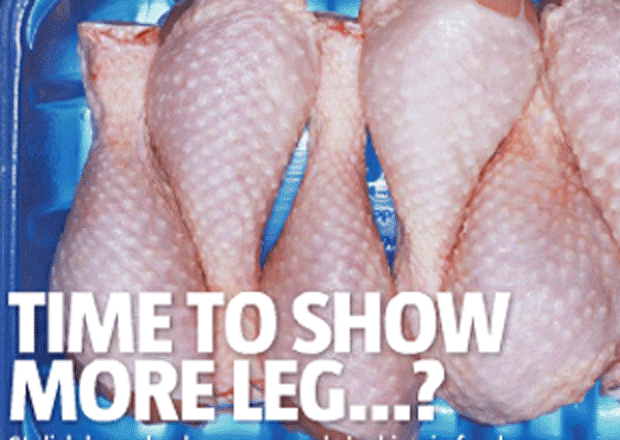
The company will also be selling 100% British turkey by the end of next month, and products will be marked with the British flag for the first time.
The turkey producer has replaced the old red-ribbon swirl with a more earthy logo in a bid to reflect its roots as a farming entity. Product packaging will also include a similar design and colour scheme.
The new corporate identity will begin rollout across all the company’s products from September, and will initially be on the cooked meats. Fresh meal-centre products will follow in October, with frozen lines converted by January.
The company is also introducing a new range under the Big Tick brand and relaunching its cooked meats business.
The new ‘Big Tick’ brand, which is launched next month, is aimed at ticking all the boxes that consumers want to see in products, including low in saturated fat, 100%-British turkey breast meat, good price and healthy ingredients.
In the cooked meats business, Bernard Matthews will streamline its product range from 50 SKUs to 30 in a bid to reduce duplication and gain more control in the category.
The initiatives, which will be backed by a £3m consumer advertising spend, were the latest planks in the company’s strategy to get itself back on track and moving forward in the wake of the sales damage that followed last year’s avian flu outbreak, said marketing director Matt Pullen.
The branding would focus on the three core values of natural goodness, good food, and caring people, added Pullen, and is aimed at restoring consumer trust in the company’s products.
In a further move aimed at bringing more clarity to the category, Bernard Matthews will now be internally classifying its cooked meats as ‘good’, ‘better’ and ‘best’.
The company will also be selling 100% British turkey by the end of next month, and products will be marked with the British flag for the first time.


No comments yet