


A good packaging revamp can distinguish a brand from the me-toos, boost its environmental credentials and drive sales growth. But overcook it and the opposite is more likely to happen, warns Catherine Dawes
If you could change one thing about your product and increase its sales tenfold, would you do it? Of course you would.
There are countless examples of brands that changed their fortunes following a packaging redesign, and even more examples of start-up brands that wouldn't have won the following they have were it not for their packaging think Green & Black's, Gü or Innocent.
Yet, so often, packaging is regarded as a necessary evil. Excess and waste have become such no-nos thanks to the green agenda and the recession that when packaging is addressed it is often with a view to reducing it, rather than to looking at how it can sell the product inside something that should be more of a priority than ever in tough economic times.
The focus on packaging reduction means new packs that offer improved functionality for the consumer have been few and far between. But now, as we tentatively emerge from recession, there's an opportunity to get the aesthetics as well as the environmental aspects of packaging right. And it seems that on the looks front too, less is more, with brands such as Tango and Cadbury being brought back to their core equities.
Keeping visual cues relevant and appealing to consumers is key to getting them to return to the fixture. But beware trying to put too many cues on pack. Chicago Town's frozen Deep Dish pizzas provide a salutary lesson in how to get it wrong. When manufacturer Dr Oetker conducted some consumer research a couple of years ago, it revealed that consumers thought the packaging made the pizzas look like a kids' snack rather than a meal and the way the images of two pizzas were placed one in front of the other made them think of an assembly line. It was no coincidence sales were falling and in 2008 were down 18.6% in value and 21.5% in volume on the previous year [IRI 52w/e 27 December 2008].
Cue a packaging overhaul by The Design Group. In December 2008, new-look pizzas hit the shelves featuring a more realistic and appetising photo of just one pizza that clearly highlighted the topping. The results speak for themselves. In 2009, sales soared 135.8% to £11.1m and 144.5% in volume [IRI 52w/e 26 December 2009].
"The relaunched packaging has been business-critical and has made a huge difference to the performance of the brand," says Chicago Town Deep Dish brand manager Stuart Yates. "A clearly communicated proposition and position has been fundamental to this success, as previous relaunches have not seen the impact we are currently experiencing."
And it's not just major brands that can benefit. A couple of years ago, Fairtrade brand Equal Exchange, whose products include teas, coffee, honey and nuts, was struggling, with sales down 8% year-on-year, according to the company.
A bright, bold packaging redesign by Good Creative in 2008 made the descriptive text the focal point. Rather than hiding away the reason for purchasing the products in small text on the back and side of packs, the new packaging shouts out their ethical credentials in big letters on the front. In the six months after the new designs hit shelves in November 2008, like-for-like sales rose 28%. Equal Exchange has also secured new listings. As a smaller brand and an organisation founded to get profits to the growers, it was crucial that the money spent on the new design produced a decent ROI and it did the sales hike in the first six months totalled £147,000, twice the redesign cost.
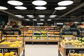
Retailers too are raising their game on the packaging front. With limited product-specific advertising for own-label goods, items need to sell themselves. "Packaging and design identify our brand and what it means to be a Sainsbury's product," says a spokesperson for the retailer's design team. "It's a way of communicating with our customers, displaying a product to its best and providing customers with important information. Fantastic packaging design is a great selling tool and the best way to promote products it is the first and last thing our customers see before making a purchase decision."
The Sainsbury's Basics packaging design, created by Williams Murray Hamm, caused such a stir it won thousands of fans on Facebook.
Tesco, meanwhile, commissioned Honey Creative to design the packaging for its Restaurant Collection of ready meals and its Disney-branded range of healthy kids' lines in October. Tesco describes the increase in sales of the new Restaurant Collection as significant, while the uplift in sales of the redesigned Disney range has been so great it plans to extend the brand across produce, impulse, ready meals and dairy.
Sadly, it's not as simple as: quick packaging refresh and hey presto, job done! Many packaging redesigns have little or no discernible impact on sales and go unnoticed by consumers. "A tweak to the design is a waste of money," asserts Richard Williams, founder of packaging design consultancy Williams Murray Hamm. "Consumers don't notice." He argues that brands and retailers should only be spending money on packaging redesigns if they are looking to change people's views of the product by giving it a new identity.
The great advantage of a new identity is that it is easier to defend from copycats, says Tim Corvin, marketing director at branding agency Webb deVlam. "Brands that let themselves become generic have little to defend their design with," he says. "If you do something bold that disrupts the norms for that category, there is no justification for a retailer to copy it."
John Mathers, MD of consultancy Holmes & Marchant, stresses that redesigns should not be done for their own sake. "It should be carried out if part of the message is not being communicated by the existing pack, or if there is something new about the product," he says, adding that if consumers feel the packaging has been changed without any alterations to the product, they can become cynical about the redesign's purpose.
A spokeswoman for Sainsbury's says, for this reason, its packaging redesigns are always undertaken as part of a greater change. "We don't redesign packaging in isolation. It is always done as part of a range relaunch, when we also look to improve taste, quality and health," she says. "This January's relaunch of Sainsbury's Be Good To Yourself range has seen some great early sales. As one part of the overall jigsaw, the redesign has certainly contributed to sales, catching the attention of our customers and showcasing the increased range and improvements in recipe or ingredients."
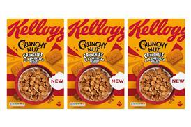
Packaging designs often aim to bring a brand into line with a current trend or are an attempt to cash in on the success of a category-changing brand. But this can destroy the differentiation within a sector and create a fixture of me-too products. Honey Creative director Doug James gives the example of the breakfast cereal aisle.
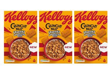
"Dorset Cereals totally reinvented what a cereal pack looked like and it stood out from the crowd," he says. "Kellogg's has taken on the same tone of voice as Dorset, but it doesn't feel as genuine because the product isn't the same quality."
Great packaging design should bring something new to a category and fundamentally change it, agrees Vicky Bullen, chief executive of consultancy Coley Porter Bell. She gives the example of Gü Chocolate Puds. "The way the brand is presented, the luxury cues and the way the puddings were delivered in glass ramekins was completely different to what had gone before," she says.
Packaging can also provide new ways of using a product. Müller introduced the concept of yoghurt with separate sauce or sprinkles through the simple device of a pot divided into two compartments, for instance.
Williams argues that part of what prevents real game-changing design is marketers falling into the trap of relying on a hackneyed set of conventions. "Can we get the logo bigger? Can we put more steam coming out of the dish or more condensation on the fruit? Anyone can do that. We should be trying to touch people. That's what gets results."
Through a combination of focus groups and trying not to upset the established order, packs can end up with the design that offends people least rather than one that really connects with people, he warns. It is better to create a design that grabs the attention of a limited number of people than one that mildly appeals to most people, he says.
Of course, the bigger the change, or the more dramatic the departure from category norms, the greater the risks. And the bigger the brand, the bigger the potential fall-out. The mantra echoing around the packaging design world at the moment is: 'Nobody wants to do a Tropicana'.
US design consultancy Arnell was tasked with modernising the packaging for Tropicana in the US in January 2009. It decided that, for the first time, the packs should show the product inside the juice and removed the image of an orange with a straw stuck in it, which was used on all Tropicana packaging in the US.
Consumers were furious and bombarded the company with complaints that they could no longer locate Tropicana in the chiller cabinet as it looked too similar to cheaper own-brand products. "Tropicana lost its key equity," says Bullen. "There was nothing about the pack that rewarded consumers for their loyalty." Consequently PepsiCo was forced to revert to the original packaging in March.
Heinz Beanz marketing manager John Alderman admits companies can be "overly cautious" with important products. "Our brands have long-term recognition so we try not to mess with the product too much," he says. That said, changes have been made in order not to "get rooted in the past and left behind", says Alderman.
Following the launch of Snap Pots in 2007, the canned baked beans got a refresh in August 2008 to give them a more modern look, for example. The beans now spelt with a z were shown on-pack for the first time in the brand's history, the word baked was removed and the shape and colour of the keystone were altered. "We do want consumers to think it looks appetising it is food after all. That's why we put the picture of the beans on pack," says Alderman.
The strategy has clearly worked. "There are a lot of contributing factors to sales. But certainly our sales have improved significantly over the past 12 months," he says. "We can count the label design as part of that, but it is also the result of advertising campaigns such as 'Beanz Meanz Heinz' and 'It has to be Heinz'.
In the current nostalgic climate, however, many brands have been going back to their roots rather than updating. For Christmas 2009, Nestlé's Black Magic was redesigned to highlight its heritage. In January 2008, Coca-Cola stripped away the generic bubbles and drips that had been added over time to its design to reveal the unadulterated white logo against a stark red backdrop. And in July, Cadbury unveiled new packaging that strengthened the logo and purple branding across its core range.
"The design of Cadbury Dairy Milk has been a progressive one that has spanned 100 years," says Jonathan Ford, creative partner at Pearlfisher, which designed the new look. "We needed to build on and strengthen the key visual equities to enrich the meaning of this design and create a system that would provide a more consistent identity for the sub-brands."
Although some brands have revamped their packaging for aesthetic reasons over the past year or so, most initiatives have been environmental. "Most of the innovation this year has been in the green area, and so it's stuff consumers wouldn't notice," says Mathers.
Lightweighting of glass bottles, switching to or increasing recycled content and opting for materials that are more easily recycled are prime examples of behind-the-scenes changes. And we can expect greater levels of activity, he says. "It might not hit the market until 2011, but we will see more activity kick off in 2010."
And not just on the environmental front. Many plans for redesigns, and new approaches were put on hold in 2009, as manufacturers and retailers tried to weather the downturn. Now that the UK is emerging from recession, it could kickstart a new wave of revamps. Mathers certainly thinks it will. "People have been caught in the headlights for the past 18 months. But now they are starting to realise this is silly and say we can't do nothing any longer!"
Focus On Packaging
If you could change one thing about your product and increase its sales tenfold, would you do it? Of course you would.
There are countless examples of brands that changed their fortunes following a packaging redesign, and even more examples of start-up brands that wouldn't have won the following they have were it not for their packaging think Green & Black's, Gü or Innocent.
Yet, so often, packaging is regarded as a necessary evil. Excess and waste have become such no-nos thanks to the green agenda and the recession that when packaging is addressed it is often with a view to reducing it, rather than to looking at how it can sell the product inside something that should be more of a priority than ever in tough economic times.
The focus on packaging reduction means new packs that offer improved functionality for the consumer have been few and far between. But now, as we tentatively emerge from recession, there's an opportunity to get the aesthetics as well as the environmental aspects of packaging right. And it seems that on the looks front too, less is more, with brands such as Tango and Cadbury being brought back to their core equities.
Keeping visual cues relevant and appealing to consumers is key to getting them to return to the fixture. But beware trying to put too many cues on pack. Chicago Town's frozen Deep Dish pizzas provide a salutary lesson in how to get it wrong. When manufacturer Dr Oetker conducted some consumer research a couple of years ago, it revealed that consumers thought the packaging made the pizzas look like a kids' snack rather than a meal and the way the images of two pizzas were placed one in front of the other made them think of an assembly line. It was no coincidence sales were falling and in 2008 were down 18.6% in value and 21.5% in volume on the previous year [IRI 52w/e 27 December 2008].
Cue a packaging overhaul by The Design Group. In December 2008, new-look pizzas hit the shelves featuring a more realistic and appetising photo of just one pizza that clearly highlighted the topping. The results speak for themselves. In 2009, sales soared 135.8% to £11.1m and 144.5% in volume [IRI 52w/e 26 December 2009].
"The relaunched packaging has been business-critical and has made a huge difference to the performance of the brand," says Chicago Town Deep Dish brand manager Stuart Yates. "A clearly communicated proposition and position has been fundamental to this success, as previous relaunches have not seen the impact we are currently experiencing."
And it's not just major brands that can benefit. A couple of years ago, Fairtrade brand Equal Exchange, whose products include teas, coffee, honey and nuts, was struggling, with sales down 8% year-on-year, according to the company.
A bright, bold packaging redesign by Good Creative in 2008 made the descriptive text the focal point. Rather than hiding away the reason for purchasing the products in small text on the back and side of packs, the new packaging shouts out their ethical credentials in big letters on the front. In the six months after the new designs hit shelves in November 2008, like-for-like sales rose 28%. Equal Exchange has also secured new listings. As a smaller brand and an organisation founded to get profits to the growers, it was crucial that the money spent on the new design produced a decent ROI and it did the sales hike in the first six months totalled £147,000, twice the redesign cost.
Retailers too are raising their game on the packaging front. With limited product-specific advertising for own-label goods, items need to sell themselves. "Packaging and design identify our brand and what it means to be a Sainsbury's product," says a spokesperson for the retailer's design team. "It's a way of communicating with our customers, displaying a product to its best and providing customers with important information. Fantastic packaging design is a great selling tool and the best way to promote products it is the first and last thing our customers see before making a purchase decision."
The Sainsbury's Basics packaging design, created by Williams Murray Hamm, caused such a stir it won thousands of fans on Facebook.
Tesco, meanwhile, commissioned Honey Creative to design the packaging for its Restaurant Collection of ready meals and its Disney-branded range of healthy kids' lines in October. Tesco describes the increase in sales of the new Restaurant Collection as significant, while the uplift in sales of the redesigned Disney range has been so great it plans to extend the brand across produce, impulse, ready meals and dairy.
Sadly, it's not as simple as: quick packaging refresh and hey presto, job done! Many packaging redesigns have little or no discernible impact on sales and go unnoticed by consumers. "A tweak to the design is a waste of money," asserts Richard Williams, founder of packaging design consultancy Williams Murray Hamm. "Consumers don't notice." He argues that brands and retailers should only be spending money on packaging redesigns if they are looking to change people's views of the product by giving it a new identity.
The great advantage of a new identity is that it is easier to defend from copycats, says Tim Corvin, marketing director at branding agency Webb deVlam. "Brands that let themselves become generic have little to defend their design with," he says. "If you do something bold that disrupts the norms for that category, there is no justification for a retailer to copy it."
John Mathers, MD of consultancy Holmes & Marchant, stresses that redesigns should not be done for their own sake. "It should be carried out if part of the message is not being communicated by the existing pack, or if there is something new about the product," he says, adding that if consumers feel the packaging has been changed without any alterations to the product, they can become cynical about the redesign's purpose.
A spokeswoman for Sainsbury's says, for this reason, its packaging redesigns are always undertaken as part of a greater change. "We don't redesign packaging in isolation. It is always done as part of a range relaunch, when we also look to improve taste, quality and health," she says. "This January's relaunch of Sainsbury's Be Good To Yourself range has seen some great early sales. As one part of the overall jigsaw, the redesign has certainly contributed to sales, catching the attention of our customers and showcasing the increased range and improvements in recipe or ingredients."
Packaging designs often aim to bring a brand into line with a current trend or are an attempt to cash in on the success of a category-changing brand. But this can destroy the differentiation within a sector and create a fixture of me-too products. Honey Creative director Doug James gives the example of the breakfast cereal aisle.
"Dorset Cereals totally reinvented what a cereal pack looked like and it stood out from the crowd," he says. "Kellogg's has taken on the same tone of voice as Dorset, but it doesn't feel as genuine because the product isn't the same quality."
Great packaging design should bring something new to a category and fundamentally change it, agrees Vicky Bullen, chief executive of consultancy Coley Porter Bell. She gives the example of Gü Chocolate Puds. "The way the brand is presented, the luxury cues and the way the puddings were delivered in glass ramekins was completely different to what had gone before," she says.
Packaging can also provide new ways of using a product. Müller introduced the concept of yoghurt with separate sauce or sprinkles through the simple device of a pot divided into two compartments, for instance.
Williams argues that part of what prevents real game-changing design is marketers falling into the trap of relying on a hackneyed set of conventions. "Can we get the logo bigger? Can we put more steam coming out of the dish or more condensation on the fruit? Anyone can do that. We should be trying to touch people. That's what gets results."
Through a combination of focus groups and trying not to upset the established order, packs can end up with the design that offends people least rather than one that really connects with people, he warns. It is better to create a design that grabs the attention of a limited number of people than one that mildly appeals to most people, he says.
Of course, the bigger the change, or the more dramatic the departure from category norms, the greater the risks. And the bigger the brand, the bigger the potential fall-out. The mantra echoing around the packaging design world at the moment is: 'Nobody wants to do a Tropicana'.
US design consultancy Arnell was tasked with modernising the packaging for Tropicana in the US in January 2009. It decided that, for the first time, the packs should show the product inside the juice and removed the image of an orange with a straw stuck in it, which was used on all Tropicana packaging in the US.
Consumers were furious and bombarded the company with complaints that they could no longer locate Tropicana in the chiller cabinet as it looked too similar to cheaper own-brand products. "Tropicana lost its key equity," says Bullen. "There was nothing about the pack that rewarded consumers for their loyalty." Consequently PepsiCo was forced to revert to the original packaging in March.
Heinz Beanz marketing manager John Alderman admits companies can be "overly cautious" with important products. "Our brands have long-term recognition so we try not to mess with the product too much," he says. That said, changes have been made in order not to "get rooted in the past and left behind", says Alderman.
Following the launch of Snap Pots in 2007, the canned baked beans got a refresh in August 2008 to give them a more modern look, for example. The beans now spelt with a z were shown on-pack for the first time in the brand's history, the word baked was removed and the shape and colour of the keystone were altered. "We do want consumers to think it looks appetising it is food after all. That's why we put the picture of the beans on pack," says Alderman.
The strategy has clearly worked. "There are a lot of contributing factors to sales. But certainly our sales have improved significantly over the past 12 months," he says. "We can count the label design as part of that, but it is also the result of advertising campaigns such as 'Beanz Meanz Heinz' and 'It has to be Heinz'.
In the current nostalgic climate, however, many brands have been going back to their roots rather than updating. For Christmas 2009, Nestlé's Black Magic was redesigned to highlight its heritage. In January 2008, Coca-Cola stripped away the generic bubbles and drips that had been added over time to its design to reveal the unadulterated white logo against a stark red backdrop. And in July, Cadbury unveiled new packaging that strengthened the logo and purple branding across its core range.
"The design of Cadbury Dairy Milk has been a progressive one that has spanned 100 years," says Jonathan Ford, creative partner at Pearlfisher, which designed the new look. "We needed to build on and strengthen the key visual equities to enrich the meaning of this design and create a system that would provide a more consistent identity for the sub-brands."
Although some brands have revamped their packaging for aesthetic reasons over the past year or so, most initiatives have been environmental. "Most of the innovation this year has been in the green area, and so it's stuff consumers wouldn't notice," says Mathers.
Lightweighting of glass bottles, switching to or increasing recycled content and opting for materials that are more easily recycled are prime examples of behind-the-scenes changes. And we can expect greater levels of activity, he says. "It might not hit the market until 2011, but we will see more activity kick off in 2010."
And not just on the environmental front. Many plans for redesigns, and new approaches were put on hold in 2009, as manufacturers and retailers tried to weather the downturn. Now that the UK is emerging from recession, it could kickstart a new wave of revamps. Mathers certainly thinks it will. "People have been caught in the headlights for the past 18 months. But now they are starting to realise this is silly and say we can't do nothing any longer!"
Focus On Packaging


No comments yet