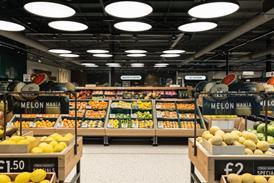
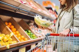
What you get is what you see, but not always to its best advantage as non-food merchandisers struggle with space limitations to create vistas and ‘product journeys’. Siân Harrington reports

Britain’s big grocers are facing an increasingly perplexing dilemma in 2004: how to fit a quart into a pint pot. The success of their non-food ranges means that supermarket space is at a premium as they seek to grow the offer.

But increasing non-food brings a dilemma. How do food retailers present the offer in the best possible light? Should they approach merchandising from the perspective that shoppers are in grocery mode when on a supermarket trip, with convenience, simplicity and signage the key? Or do they need to adopt some of the visual language used in the high street stores where consumers are in a different shopping mode?

The Grocer asked the experts about the theory (see overleaf) and teamed up with merchandising and shopper behaviour specialist Siemon Scamell-Katz, chairman of ID Magasin, to learn lessons from the latest supermarket non-food areas. We toured a number of stores including Morrisons in Catcliffe, South Yorkshire; Sainsbury’s in Haverhill, Suffolk; Tesco’s Cheshunt store and Asda’s new Stevenage store, both in Hertfordshire.

Scamell-Katz says: “The key is shopping mode. In this context convenience is about all product being in one store but shoppers approach different categories in different modes. The issue is whether they are in grocery or treat mode.”

This view is echoed by Mike Dennis, analyst at CAI Cheuvreux. “The biggest barrier is to non-food growth is mode of shopping. There are two separate shopping missions. Not many shoppers
are going to pick up a Dyson vacuum cleaner while in food shop mode. They may see the product, make a mental note on price and then go back at the weekend. Likewise you do not want to walk round a store with a glass vase in your trolley, putting food on top of it.”

So how are the grocer retailers addressing this issue? There appears to be two approaches. Tesco Extra in Cheshunt, for instance, makes no attempt to differentiate non-food categories through fixturing and visual merchandising is minimal. It is appealing purely to the price-conscious consumer, with merchandising techniques reflecting value through low cost fixtures. By way of contrast, both Sainsbury’s in Haverhill, and Morrisons in Catcliffe have attempted to separate commodity non-food from treats. They both have clearly defined areas with a different visual treatment.

Neither approach is necessarily wrong but whichever one you take you have to consider shopper mode, product category and get the basics right, says Scamell-Katz. And this is where the grocers fall down.

For example, the pile it high on metal fixtures approach only lends itself to certain products. When it comes to CDs, bubble bath and magazines, shoppers are happy to pile them into their trollies along with tomato ketchup, a box of cornflakes and fresh fruit. These have practically become commodity items, requiring little decision-making on the behalf of the
shopper. The fact supermarkets only stock bestselling CDs and DVDs means shoppers are not expecting to browse in the same way as they would in HMV. Visual merchandising in all these cases is about making product visible and selection easy. Convenience is the key factor here and simple merchandising, strongly-defined product zones and clear signage directing the shopper into the aisle are what matters.

Generally the grocers have this one sewn up - they offer a limited range at keen prices and this is what attracts the shopper. The difficulties come in clothing, homewares and electricals, which are much trickier categories to merchandise.

“Visual merchandising is done badly in areas such as TVs, bins, luggage, bedding and homewares,” says Dennis. “The configuration of space here needs to be more innovative but this has to be balanced with committing space to slow selling lines that have a low gross profit per square foot.”

Tesco had found a way round this by offering an extended range catalogue for white goods. This is a difficult category to merchandise, being both space hungry and visually boring. Tesco displays one washing machine and one fridge, above which there is the order catalogue. In categories like this it is no surprise that it is the grocery retailers’ online operations which are driving sales.

One of the issues in these categories is price. “If you are buying a TV for £50 then presentation doesn’t really matter but if it’s £400 then value-added retailing is needed, with better presentation and advice,”according to Scamell-Katz.

However, he adds that even when price is a major factor the shopper’s mode needs to be considered.

“While there is a wide range at Tesco, the visual merchandising contradicts any sense of authority. In contrast Asda combines range width with lighting and fixtures to create a sense of ownership,” he says. “Tesco felt like an implanted range that would be bought on price, rather than with any sense of reward, which is usually part of the non-food experience.”

All our experts agree that clothing and homewares deserve different treatment. After all, Top Shop, Debenhams and Marks and Spencer do not put all that effort into visual merchandising for nothing. Indeed, Tesco is putting Cherokee at mezzanine level, adjacent the instore café in other Extras, helping to create much-needed “emotional impact” says Karl McKeever, brand director of Visual Thinking.

Both homewares and clothing are key battlegrounds and in the former Morrisons and Sainsbury have made valiant efforts.

The new At Home with Morrisons department may not be overly adventurous but the shopper is clearly walking into a coherent area while the range is limited but relevant to the its customer and keenly priced. “Morrisons has taken visual language from different retailers, for example the chrome back wall and glass shelving. It has a John Lewis/M&S feel to it which raises customers’ expectations - and then on top of this the shopper then sees the great prices,” says Scamell-Katz.

Sainsbury’s homewares department is spacious and there are a few attempts to inspire people by pulling together products, such as a breakfast treatment. The appealing graphics are refreshed every two to three weeks and clearly signpost where product is to be found.

All bar Tesco had given thought to lighting, with different lighting used to create a warmer effect in homewares and to accentuate product in clothing.

Asda in Stevenage wins hands-down in merchandising clothing. It has done much work in layout and fixturing and uses mannequins to suggest combinations. In non-food generally this store was most authoritative in width and depth and it had separated food and non-food areas, with a dedicated entrance to the latter. And while lacking the space of a store like Eastlands, Manchester, where full room sets are displayed, there is an attempt to create visual interest by giving shoppers ideas for a baby’s bedroom, for instance.

The key issue for all grocery retailers is whether shoppers are drawn into the non-food area. Location in the store is clearly important here, as is visibility of product.

Scamell-Katz says all the stores have work to do on visual merchandising, especially in the large formats.

“Regardless of the value proposition grocers are competing with high street retailers in some categories. The principles of making a decision to buy a towel are no different in Tesco than in Debenhams or John Lewis - it is about do I like it, is it the right colour and is the price right. “

He adds: “Unless the visual merchandising makes all of these obvious you will walk by. Grocers could benefit from input from a large space retailer, particularly with a view to creating vistas and product journeys.”