Close menu
- Home
- Retail & Wholesale
-
Products & Suppliers
- Back to parent navigation item
- Products & Suppliers
-
Product Categories:
- Back to parent navigation item
- Product Categories:
- Alcoholic drinks
- Bakery
- Cereals & breakfast
- Cheese
- Chicken & poultry
- Chocolate
- Confectionery
- Crisps, nuts & snacks
- Dairy
- Fish
- Fresh produce
- Frozen
- Household
- Meat
- Own Label
- Sauces & condiments
- Seasonal
- Soft drinks
- Vaping
- Vegan & plant-based
- World foods
- Suppliers
- People
- Reports & Data
-
Topics A-Z
- Back to parent navigation item
- Topics A-Z
-
Popular topics:
- Back to parent navigation item
- Popular topics:
- Cost of living crisis
- Crime
- Deposit Return Schemes
- Finance
- Government & Regulation
- Health
- Inflation
- Loyalty
- Marketing
- Mergers & Acquisitions
- New Product Development
- Sourcing
- Supply chain
- Sustainability & environment
- Technology
- Ultra Processed Foods
- Vaping
- A-Z all topics
- Content by type:
- Events
- Ask iA
- Subscribe now

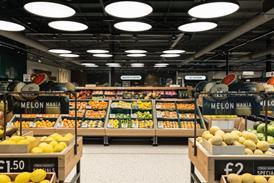


Aldi to get fresh logo to complement ‘modern’ image
By Julia Glotz2017-03-09T15:22:00
The new logo is already in use in China and will be coming to the UK in due course
Already have an account? Sign in here
Already have an account? Sign in here