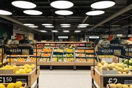
Brands are often afraid to go for a new look. It can work wonders says Siân Harrington

Take a trip down the hot milky drinks aisle in Tesco and what do you see? So many swirls of steam rising from mugs that it’s hard to differentiate the products. Be it Cadbury, Ovaltine, Galaxy or Tesco’s own-label, instant hot chocolate or malt drinks all look the same.
In the debate about copycat brands, the retailer is typically portrayed as the baddie, producing own-label versions of branded products and then, to add insult to injury, using the same visual cues.
But as the example above shows, brand manufacturers can be just as bad. Sure, there is the argument that certain visual cues help the consumer find the category. But the reality is that shelves are full of me-too products in me-too packaging. Why would consumers pay more for a branded product when the range all looks the same - and the own label version looks just as good?
“Brands have turned marketing into science and lost creativity. This delivers the lowest common denominator solution. They won’t increase sales that way,” says Richard Williams of award winning packaging designer Williams Murray Hamm. “They need to be bold in their packaging. Packaging is about intellectual property, not execution, and inventive packaging is great advertising.”
In other words, only by creating a packaging design that truly encapsulates
their brand can they have a differentiation that is hard for others to replicate.
Take Horlicks. It, too, featured a mug with steam on its packaging until last year when owner GlaxoSmithKline realised the brand was urgently in need of an overhaul.
“Research showed consumers thought of Horlicks as a pipe and slippers, sitting by the fire affair, something their gran would drink. We had our core loyalists but needed to attract a younger consumer if we were to survive,” says GSK marketing category director Ian Ainsworth.
This same research uncovered one nugget - that people associated Horlicks with relaxation and sleep. GSK identified a group of consumers that it termed anxious sleepers, those people juggling careers, family and social life who had little time to unwind in the evening and who went to bed with their minds racing. A TV campaign was developed to convey the change of image but GSK needed to pull people into the brand in-store.
It drafted in Williams Murray Hamm to bring the brand to life and break out of the stereotypical category conventions. “Great brands provoke reaction but many just lose what makes them special,” says Williams.
“Most brands simply slip off people’s radar and our task is to wake them up. Horlicks had lost the message that it was about sleep.” The result was the use of a ‘do not disturb’ sign on a moon and the removal of many of the messages cluttering the pack. The new packaging was introduced on shelves in July last year. In the second half of the year, 200,000 new users were brought into the Horlicks brand, predominantly in the target 25-45 anxious sleeper demographic. Year-on-year sales in this same period shot up 18%.
With margins getting ever tighter and retailers extracting every last penny from suppliers, fear is holding brand suppliers back from emulating GSK’s bold step, says Jonathan Ford, creative partner at design agency Pearlfisher. “Brands are fearful of being exposed and losing something they have spent years building. Very few are brave enough to take risks.”
Pearlfisher asked its clients about their top 10 fears. The responses showed they didn’t understand how to evaluate design, that it came down to a random and subjective senior management decision.
They didn’t have confidence in the creative process and worried any change may result in lost sales. “It’s no surprise a
junior brand manager managing a 100-year-old brand is scared,” says Ford.
Ainsworth agrees risk is a big factor. “Horlicks is131 years old and we risked a backlash by changing. But if we didn’t do something the risk was even greater as we would lose core users,” he says.
But Ford says consumers are also affected by fears and are looking for something to free them from this. Brands need to be distinctive and communicate to consumers’ heads and hearts, he says, and this needs to be conveyed in the packaging.
“Brands need to tell a story but many do not have a compelling story in the first place. They fall into the middle ground and that’s not a great place to be,” he says.
Packaging design should be used to express this story but the key is that it must be truthful. A good example is Hovis, another Williams Murray Hamm design. British Bakeries could have picked up on the theme of provenance favoured by many food companies and used pictures of ploughed fields or shire horses. Instead it took the bold step of featuring baked beans and cucumbers on its packaging. It didn’t try to be anything else than sliced white bread that goes well with these toppings. For every £1 spent on packaging, Hovis got £3 back.
Pearlfisher’s design for Innocent smoothies is simple and distinctive, like the product itself. Its work for Waitrose’s new personal care brand Umi makes the products look like food, using the fact that they include ingredients like rice and honey.
Meanwhile, skincare brand Aveda has introduced cork packaging for lipsticks. This recyclable material turns the lipstick into a premium product but fits Aveda’s philosophy of being ethical and responsible.
Clipper Teas, which won the latest Design Effectiveness Awards, moved away from the cliched plantation imagery and premium typography to a sober design inspired by National Geographic, whereby the region
where the tea is grown is illustrated by indigenous animals. With figures up 373% in 2004, with no other brand-building activity, Clipper founder Mike Brehme describes the identity as “the single most important activity we have undertaken in our 20-year history”.
What these examples have in common is that their design is inextricably woven into their product values. The packaging is focused on communicating a single fact well. Williams says: “When you are doing new packaging, you don’t need a bigger food shot. The consumer knows it is food. You don’t need a cat licking lips - they know it is cat food. You need something that expresses the brand.
“In own label every piece of packaging is corporate. The one area of greatest weakness at Tesco is packaging. It is formulaic, doesn’t respect the customer and doesn’t reflect the genial nature of Tesco.”
Pearlfisher’s Ford believes any brand can benefit from a bolder proposition. “I would like to get my hands on Birds Eye peas. Many people forget that frozen peas are actually very fresh but it has become a price-based, commodity product. I would like to reposition it as a premium, pure product.”
Research by Dragon Brand Consulting shows credibility is higher for brands with strong, unique identities and packaging, which makes retailer copies look like cheap imitations. As Ainsworth says: “Brands needs to show originality and break free from category conventions. They have got to say one thing consistently to a high standard. It is not a tick box exercise, it’s about having something others cannot steal.”

Topics