


Pernod Ricard is rolling out a new branding across its Jacob’s Creek portfolio to help consumers navigate the fixture – and adding two new Italian varietals.
The Australian brand has revamped its packaging and introduced a new logo across the range – a creek flowing between two vine leaves – to provide a more consistent image of the brand and promote its heritage, while allowing consumers to differentiate between tiers.
The objective is to have the bottles merchandised together, marketing manager Ary Ganeshalingam told The Grocer. Although the icon is consistent across the brand, there are subtle differences to denote premiumisation across the tiers.
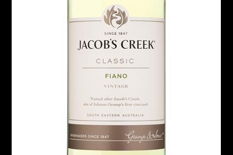
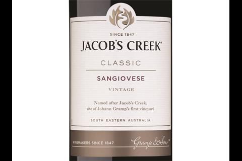
The classic range has been retitled Jacob’s Creek Classic on the bottle, and will include a platinum foil logo, while the logo on the Reserva will be embossed in gold foil. Sparkling has also benefited from a more premium look, with gold foil replacing the black.
“It’s a range of wines that works very well together on shelf,” Ganeshalingam said. “We are looking at new ways to build the brand for the retail space – how to build the presence on shelf and help the consumer navigate the fixture.
“The primary task was its relevance to the retailer and how that can be better leveraged.”
New varietals
The company has also added two new varietals, Fiano and Sangiovese to its classics range to tap into the popularity of Italian wine in the UK. They will be available from March (rsp: £8.05)
“It is one of several varietals that aren’t household names at the moment, but will be seen more on shelves,” winemaker Nick Bruer said. “We feel they would tie in nicely with consumer trends towards food-friendly crisp and elegant wines. They won’t replace the workhorses of Australian shiraz, chardonnay or cabernet sauvignon, but could be a strong niche.”
Although sales of Australian wine continued to be strong in the UK, sales of Jacob’s Creek fell 2.7% last year [Nielsen 13/10/13] on volumes down 2.6%.


2 Readers' comments