


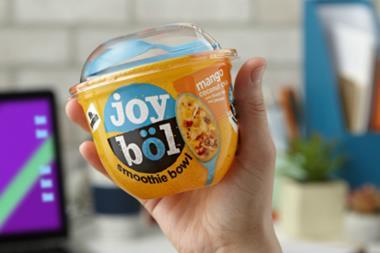
Quaker Oats looks set for a rebrand across its porridge ranges – to accelerate value growth and capitalise on the rising popularity of hot breakfast options.
The PepsiCo-owned brand has registered a series of designs with the Intellectual Property Office for its traditional porridge oats and Oat So Simple lineups.
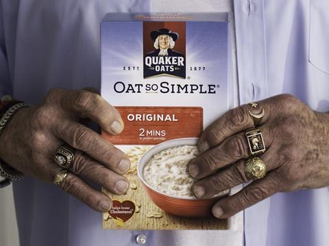
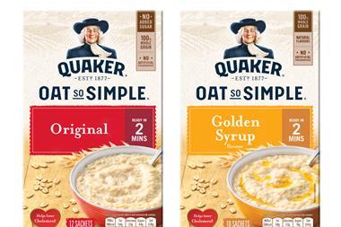
Most notably, the Quaker Man logo has been updated for the first time in six years. Its red background has been axed and the character has been given a gentle makeover.
The new look also features a bigger main panel and drops the ‘blue sky’ background in favour of a landscape illustration in a neutral colour. The photography is largely unchanged.
The revamped porridge packs will roll out in June, backed by a heavweight push.
The changes were “part of our ongoing commitment to drive excitement and attract new audiences to the cereals category” said PepsiCo. They would “reflect consumer appetite and champion the goodness of oats.”
The overhaul follows a slow year of sales in the mults for Oat So Simple, which is up just 0.7% in value to £99.4m on volumes up 1% [IRI 52 w/e 4 November 2017]. Quaker’s tradtional porridge oats have done slightly better in terms of value, rising 1.4% to £12.9m, but volumes are down 0.2%.
For the whole hot cereals category, take-home value sales are in a stronger position. They are up 2.7% to £239.1m [Kantar Worldpanel 52 w/e 8 October 2017] – in spite of fewer Brits eating breakfast at home.
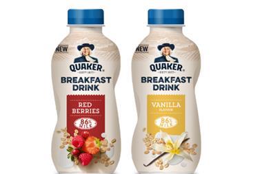
Earlier this year, the wider Quaker brand credited NPD such as To Go Breakfast Squares, launched in July, for a solid 3.3% value rise [Nielsen 52 w/e 30 December 2017].


No comments yet