


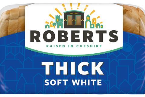
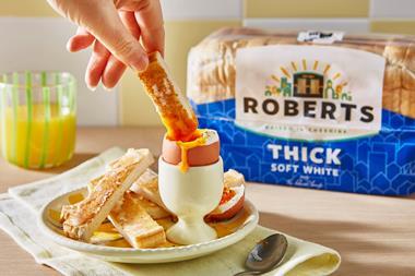
Roberts has unveiled its second major rebrand in six years to highlight its Cheshire provenance.
The fourth-generation bread business has updated its logo to “celebrate its Cheshire roots and baking heritage”.
The new logo features the bakery’s distinctive cooling towers, alongside a new ‘Raised in Cheshire’ strapline, which denotes its “proud association with the region”.
It will roll out across Roberts’ core range this month.
The new visual will also start to appear on the company’s fleet of vehicles.
The rebrand is intended to strengthen the business’s sales in Cheshire, North Wales, Lancashire and the West Midlands.
It forms part of a wider post-pandemic strategy for the business, following an £18m investment and the appointment of Bill Thurston as MD in October 2022.
Thurston said the rebrand was “a celebration of all that Roberts has done very well for over 130 years, baking great products to meet the needs of real people”.
It would “be the foundation for recovery after a challenging few years” and would set out “a clear offer to those who know us and those who don’t – from Northwich to the nation”, he added.
According to The Grocer’s Top Products report, value sales of Roberts’ loaves slumped by 14.9% to £37m in the 52 weeks to 10 September 2022 [NielsenIQ].
The rebrand will be supported by trade and consumer marketing activity.
Roberts’ last major refresh took place in September 2019, when it changed its name from ‘Roberts Bakery’ and invested £500k into a multichannel marketing push.


No comments yet