


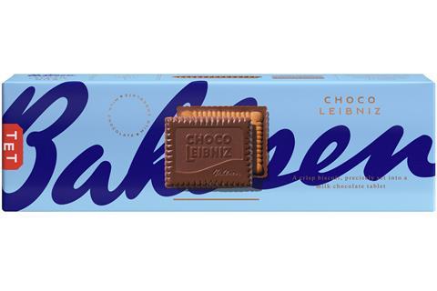
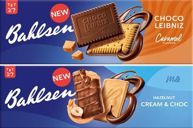
Bahlsen has unveiled a new look across its entire portfolio of biscuits.
The “bold and distinctive” new design is “one of the biggest developments of the brand’s identity in the company’s 132-year history” and embodies its history of art, beauty and craftsmanship, said the brand.
The redesigned packs place an image of the biscuit front and centre and include reinstated original product names, such as Ohne Gleichen instead of Praline Squares.
Chief commercial officer Jonathan Duffin said the new look came alongside a new leadership team for Bahlsen, with the fourth generation of the family taking over from the third.
“Within the transition there was a discussion about what the company really stood for and what made us special and unique in the past, and it was this dedication to craft, design and precision,” he added.
“We’re known for these beautiful, precise biscuits – we wanted the brand positioning to really live up to that, especially the packaging.”
The rebrand will be supported by a £5m media spend, with campaigns running across TV, digital, print, shopper and social media channels.


No comments yet