

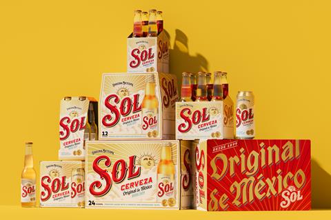
Mexican lager brand Sol has unveiled a packaging refresh and a new “global identity”.
The Heineken-owned brand was “once a craft pioneer, championing its Mexican provenance and its sun namesake”, claimed Love, the Manchester-based creative agency behind the rebrand.
However, its use of this heritage “had become diluted, making it difficult to maintain visibility and relevance in a crowded market”.
The brand had therefore elected to go back to the drawing board, working with illustrator and lettering artist Tobias Hall to redraw all elements on the bottle label, including the Sol wordmark, background clouds and sun face.
The sun icon now shows its full face for the first time, making it “a radiant, optimistic symbol of Sol’s heritage”, according to Love.
The colour palette has also been refreshed, with the introduction of teal “to represent a crisp, clear blue sky and the liquid’s freshness”.
Meanwhile, supporting type reflected the brand’s origin “through a diverse mix of font styles reminiscent of ornate archive labels”.
Off-trade sales of Sol in the UK are in significant decline, falling 39.3% to £11.1m in the year to 19 April 2025 [NIQ].
Like other underperforming brands in Heineken UK’s roster, Sol was reformulated to 3.4% abv this year to take advantage of new duty rules offering savings on lower abv beers.
Other brews to have been watered down by HUK include Amstel, John Smith’s and – most recently – Foster’s.
The new-look Sol lager will roll out across global markets “in the coming months”, supported by a multi-channel campaign called ‘Welcome to the Sunny Side’.


No comments yet