Close menu
- Home
- Retail & Wholesale
-
Products & Suppliers
- Back to parent navigation item
- Products & Suppliers
-
Product Categories:
- Back to parent navigation item
- Product Categories:
- Alcoholic drinks
- Bakery
- Cereals & breakfast
- Cheese
- Chicken & poultry
- Chocolate
- Confectionery
- Crisps, nuts & snacks
- Dairy
- Fish
- Fresh produce
- Frozen
- Household
- Meat
- Own Label
- Sauces & condiments
- Seasonal
- Soft drinks
- Vaping
- Vegan & plant-based
- World foods
- Suppliers
- People
- Reports & Data
-
Topics A-Z
- Back to parent navigation item
- Topics A-Z
-
Popular topics:
- Back to parent navigation item
- Popular topics:
- Cost of living crisis
- Crime
- Deposit Return Schemes
- Finance
- Government & Regulation
- Health
- Inflation
- Loyalty
- Marketing
- Mergers & Acquisitions
- New Product Development
- Sourcing
- Supply chain
- Sustainability & environment
- Technology
- Ultra Processed Foods
- Vaping
- A-Z all topics
- Content by type:
- Events
- Ask iA (beta)
- Subscribe now

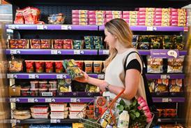
How European retailer Picnic is breaking own-label packaging rules
By George Nott2023-05-11T08:40:00
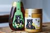
Source: Picnic
Picnic’s artsy own-label range forgoes a sense of corporate identity and prioritises delighting shoppers
Already have an account? Sign in here
Already have an account? Sign in here