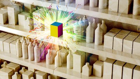
Sustainable products often communicate their eco-credentials with dull designs that get straight to the point. We asked design agencies to spice up their packaging
Worthiness comes at a price. At least, it seems that way in sustainable packaging. Browns, dull greens and other functional touches (and wording) dominate the designs of the most cutting-edge eco-friendly products on shelves. It seems as though brands face a choice: create a look that is easy on the eye or easy on the planet.
In reality, the dull browns and greens are more of a considered design choice. They have become synonymous with sustainability, which means the design is doing its primary job: communicating those eco-friendly benefits to the consumer. “Brands want to drive this message to consumers that they’re taking this stuff seriously,” says Elliot Wilson, strategy expert at branding and design specialist The Cabinet Agency.
“The packaging is pretty nondescript and not really harnessing the personality of the brand. But I suspect they’re doing it on purpose to show they’re on this journey,” he says.
A look at our top paper packaging innovations illustrates the point. All have required careful thought and investment in cutting-edge techniques – yet the designs are fairly uniform. Unilever’s brown-hued paper laundry detergent bottles could almost be mistaken for the Absolut vodka paper bottles.
That may not be a problem now, as the innovative nature of these technologies – and their appeal to consumers – outweighs the need for strong branding. But it could be in future, says Wilson, as these sustainable alternatives become more commonplace. And especially for high-end goods. “I just don’t buy that people would buy a 12-year-old whisky in what looks like a milk carton,” he argues. “So the question is how do you genuinely build brand into it? Because, for now, it’s very much invisible.”
Jack Holloway, industrial design lead at Landor & Fitch, reiterates the point. “It’s not enough to stand up on the issue of sustainability – brands need to stand out too, with packs that consumers want to put in their shopping basket.”
So we asked design agencies to devise some answers to this tricky packaging dilemma, while still hitting the mark on design. Here’s what they came up with, from soluble drinks packs to a crisp vending machine…
Concept 1
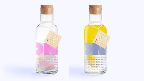
ONS: A drinks pack that dissolves in water
The very concept of ONS sounds unlikely: drinks packaging that dissolves in water. But The Cabinet Agency, which came up with this design, got around the obvious practical challenges with innovative thinking about what a drinks brand actually is.
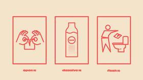
ONS works like this: consumers buy flavoured lozenges, which they dissolve in water to make the drink of their choice. Now for the killer element. The packaging can be dissolved in water, too (to dispose of, not to drink). Its biodegradable properties mean it could alternatively be thrown away as compost. But dissolving is far more fun – and as the marketing posters suggest, the packs can even be flushed away.
And fun is exactly what this brand is about. ONS is packed full of innuendo and knowing nods to its target audience of gen Z and young millennial consumers. The reusable bottle you receive in an ONS starter pack (picture two) has deliberate similarities to the Love Island water bottles. The name ONS – an abbreviation of ‘one night stand’, for the uninitiated – looks to communicate the transient nature of the products in a playful way. And yes, the packs were deliberately designed to look like condom wrappers, says The Cabinet Agency’s Elliot Wilson. These carry slogans like ‘I could drink you right up’.
It’s all part of a “youthful, irreverent” tone for the brand. “It’s communicating that ‘we leave no mark’ but in a really engaging, humorous and gen Z kind of way,” says Wilson. The Cabinet Agency has also thought about the type of drink this audience will want. It aims to put “the fun into functional” by infusing the drinks lozenges with vitamins designed to boost mood.
The young target market means social media will play a major part of the marketing strategy, alongside outdoor ads. Then who knows? It might just ‘couple up’ with a Love Islander for a sponsorship deal…
Concept 2
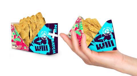
Reve: Crisps without the environmental crunch
Crisps, but not as you know them. The notoriously hard-to-recycle flexible plastic packs are nowhere to be seen. And there is no compromise on freshness, either.
That’s thanks to an entirely new way of dispensing crisps, dreamt up by global design firm Marks. Vending machines are at the heart of its Reve brand. These are filled with different flavours of crisps, kept loose in a condition that preserves quality.
When someone fancies a snack, they need only select an option from the vending machine and it will dispense the crisps into a pocket-sized pack made from 100% recyclable, FSC-certified cartonboard. As the crisps are designed to be eaten on-the-go, packs can do without the foil layer that usually preserves freshness.
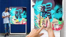
What’s more, Reve makes recycling easy. The vending machines accept used flattened packaging, and each returned item earns a ‘loyalty credit’ that shoppers can use to try new flavours.
Granted, these vending machines need power. But in keeping with the sustainable concept, they use power exclusively from renewable sources, and will only turn on when the in-built sensors detect movement nearby.
Even the flavours have a sustainable feel, with ingredients rotating seasonally to highlight “the diversity of nature”. For example, winter flavours will feature turnips, while pea will be a key ingredient in the summer. And all flavours are plant-based, of course. It’s all part of the ‘little bite, big impact’ tagline.
High footfall will be crucial to the vending machine premise. For that reason, Reve is aimed at cities – a strategy reflected in its urban-style graffiti artwork.
The design and tone of voice mirror “the ever-more-familiar semiotics of plant-based brands that draw heavily on personality and tone of voice”, says Marks. Add a cool vending machine into the mix, and you’ve got crisps for the next generation.
Concept 3
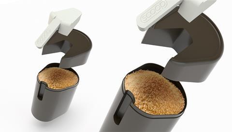
Scoop: Making baking refillables sleek
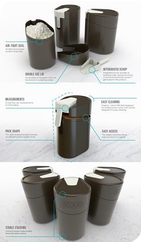
With the rise of refill store concepts, so opens the door to specially designed refill containers.
“Baking suffers from many useability issues that are difficult to tackle with its low-cost, disposable packaging,” says Echo, the design agency behind Scoop. “Many consumers have developed their own home storage systems for flours and sugars, but as we move to circular systems, and in-store refills they’re impractical.”
The Scoop container would be built on a loop system, with the aim of being desirable, display worthy, hygienic and mess free. Echo says it would also represent an improvement to the baking experience through easy measuring with the built in measuring cup.
The Scoop could hold a multitude of bakery ingredients as well as other dry goods with sealable nature ensuring the products remain fresh and in peak condition.

Plastic Free July 2021: what it means for supermarkets and shoppers
Now in its 10th year, the challenge encourages people to avoid using or buying single-use plastic for 31 days
- 1
- 2
- 3
- 4
 Currently
reading
How to make sustainable packaging pop: creative challenge
- 6
- 7
- 8












No comments yet