


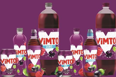
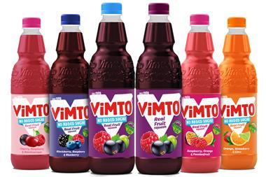
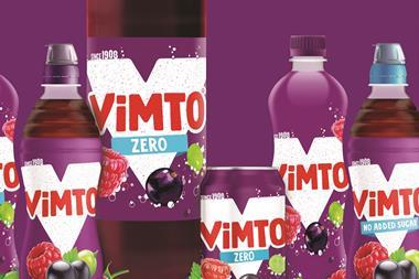
Vimto is kicking off the new year with a new look across its entire range.
The Nichols-owned brand has unveiled a complete redesign claimed to deliver a “cleaner, bolder and more modern look”.
The new look maintains the red, white and purple colour palette, and pays homage to the brand’s heritage with the inclusion of ‘since 1908’ on the front of pack.
The addition of a white ‘V’ behind the brand name would provide “strong on-shelf standout”, said Vimto.
It follows a successful year for Vimto in the mults: sales grew 20.1% (£9.3m) to £55.9m, on volumes up 19.9% [Nielsen 52 w/e 5 September 2020].
Senior brand manager Becky Unwin said the new look “not only speaks to our target market but also celebrates and communicates Vimto’s personality”.
She added the redesign enabled Vimto to better communicate its benefits, such as real fruit ingredients and added vitamins.
“The redesign marks the start of what will be an exciting year and we can’t wait to reveal what we have in store,” said Unwin.


No comments yet