From whisky to deodorant, a new wave of brands are proving that recycled, refillable, and responsible products can still be stylish — and sell
Sustainable packaging has a distinctive style. Or, some might say, a lack thereof. Over the years, a beige cardboard outer layer has become the calling card of brands with eco-friendly packaging. But, times are changing. Increasingly, that beige look just isn’t enough to persuade eco-minded consumers to part with their cash.
“Five or 10 years ago, if you had truly sustainable packaging, that’s what the brand could have stood for on its own,” says Chris Blythe, founder of branding and design agency The Brand Nursery. “Now it’s the norm, impactful design is the important thing.”
Cue a host of designs that are both beautiful and sustainable. Eco-friendly toilet paper brand Who Gives a Crap is staging impactful displays in supermarkets, buoyed by standout, colourful packaging. Whisky brand Bruichladdich is using bright, lightweight bottles to help its classic single malt stand out from rivals. Then there are refill brands like Purdy & Figg and Wild, which make a selling point of their premium-looking designs.
So how is sustainable packaging evolving? How are brands signalling their environmental credentials without all that beige cardboard? And how much of a difference is the new eco-aesthetic making to sales?
Beige cardboard packs weren’t always synonymous with sustainability. In fact, they started out with different connotations, says Blythe. “Probably 15 or 20 years ago, brown craftboard was being used to convey home-made or kitchen-made, so they looked less like they were manufactured in a factory.”
The effect was usually far from slick. “If you were printing on craftboard 20 years ago, chances are the ink would bleed through and so fine type got a bit blurry,” Blythe says.
“Paper and board was historically off-white due to the process of creating it,” explains Howard Wright, executive creative, strategy and photography director EMEA & Canada at Equator Design. “A mixture of board and paper – all heavily printed, varnished and foiled – was processed together, creating a grey pulp that could never be pure white without bleaching.”
But as pressure increased to use recycled materials for packaging, recycling processes have improved even further, meaning pure white is a possibility. Yet, to some extent, those historic associations remain.
“The perception of recycled or craft is that it should feel rougher and not look white,” Wright says. “In some cases, the board is even printed to achieve this colour difference to reassure the customer.” Those associations are particularly useful in certain sectors. Take less overtly branded spheres like takeaway food and fresh produce, where recyclability has been a challenge.
Customers find it reassuring to see “the familiar brown hues of a craft coffee cup or takeaway tray, fruit punnet or mushroom bag”, says Wright.
Standout and sustainable: three brands with modern eco-designs
Bruichladdich The Classic Laddie
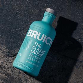
In 2023, Bruichladdich revamped the design of its signature single malt, The Classic Laddie. The bottle – hailed as “its most innovative packaging to date” – contains an average of 60% recycled glass. What’s more, it is 32% lighter than the previous bottle. The design has reduced the brand’s “global environmental impact, with fewer distribution vehicles on the roads and the ability to transport more bottles per pallet”, says Bruichladdich.
Who Gives a Crap
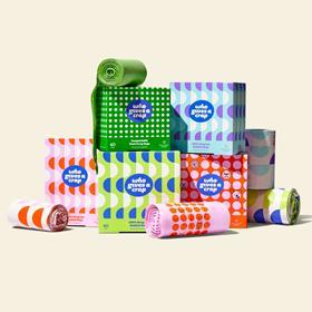
Sustainable toilet paper brand Who Gives a Crap is as known for its colourful design as for its environmental credentials. “We use humour and funky packaging to bring light to an otherwise serious issue – and disrupt an otherwise dull category,” says marketing director David Titman. The approach appears to be working. Having started out DTC, it recently signed up its millionth customer, and counts Tesco and Waitrose among its stockists.
Wild
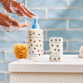
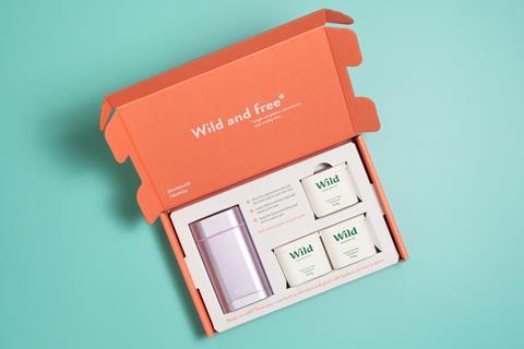
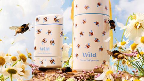
Wild was not the first refillable deodorant but when it launched in 2019, differentiation, utility and aesthetics were considered as one. Now, with a portfolio spanning lip balms, body washes and hand soaps, the brand has gone from a niche DTC operation to a serious player in retail and was acquired by Unilever earlier this year for £230m. It has most recently launched a roll-on deodorant range with designs from Emma Bridgewater and Cath Kidston.
Shoppers want recyclable packaging
And that look of recyclability can be a powerful driver of purchase. Nearly seven in 10 shoppers (68%) said recyclable packaging was either very or quite important when buying a product, in a Vypr survey of 1,899 UK adults for The Grocer (see box, p32). What’s more, 16% of shoppers would be encouraged to buy a new product if it had sustainability claims, found the Richmond & Towers Trailblazers Report this spring.
The point is backed up by carton packaging supplier Elopak. The colour of paperboard “is still ideal for many brands wanting to communicate their sustainability credentials at a glance”, says Dr Uwe Schulze, executive vice president of product & development.
Elopak recognises though that customer demands are evolving. This year, it launched a smooth white paperboard carton, alongside its natural brown board line. It says the white paperboard line has a 14% smaller carbon footprint than its standard cartons.
For Equator’s Wright, this kind of innovation plays to changing consumer preferences. As the UK population becomes savvier about recycling, they no longer need such obvious visual cues to know what goes in the recycling bin – nor what is made from recycled material.
“Recycling is top of the agenda in most households and increasing in relevance to many,” he says. “We are used to having multiple bins and making sure the correct substrate goes in the correct colour bin.”
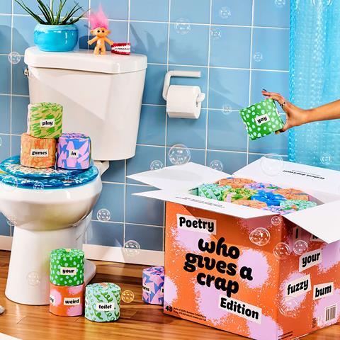
As a result, eco-friendly brands are feeling free to get more playful with their packaging. Wright cites the example of Who Gives a Crap, whose toilet rolls arrive in corrugated brown board when ordered DTC. However, the actual rolls are designed to be proudly displayed in bathrooms, with “bright, punchy, clean colours” (see above). And on retail shelves, the outer layer of packaging also comes in colourful hues.
That was a conscious choice. “It feels like we are beginning to shift to a place where eco-friendly packaging doesn’t have to be dull,” says David Titman, marketing director at the toilet roll brand.
For Titman, the shift also helps to broaden appeal beyond eco-minded consumers. “It doesn’t matter if people are choosing to buy us because we’re sustainable, or because we’re a fun, colourful brand – overall, that positive impact on the planet and global communities is still seen and felt,” he says.
A dual appeal is also evident at whisky brand Bruichladdich. In 2023, the distiller unveiled more sustainable packaging for its signature line – The Classic Laddie (see above) – that was touted as cutting CO2 emissions by 65%. Not only does it contain an average of 60% recycled glass, but the redesign was 32% lighter than the previous bottle, eliminating the secondary tin. And rather than beige, The Classic Laddie comes in a bright turquoise hue that stands out in the traditionally conservative scotch category.
“You don’t need to have secondary packaging to represent luxury, quality or to be interesting,” says Matt Burns, executive creative director at design agency Thirst, which worked on the bottle.
Consumer attitudes to sustainable packaging
25%
say recyclable packaging is very important to purchase decisions
22%
say it is very important for packaging to use sustainable materials
41%
use back-of-pack information to determine sustainability
59%
buy refillable items
57%
are swayed by the appearance of a refillable container
Source: Vypr poll of 1,899 consumers, August 2025
Premium pioneers
For Elliot Wilson, founding partner at branding, innovation and design agency The Cabinet, premium brands are leading the way in innovative sustainable packaging. “For me, it’s been done better in the higher end of things, where sustainability is built into the functional and aesthetic design,” he says.
“It’s absolutely key to stuff being successful,” he says. “There are some examples where people have done it really badly and haven’t given any thought to aesthetics, just this idea of sustainable packaging, and I don’t think you can pull apart the two when you’re a premium, luxury brand.”
A pure focus on sustainability is only feasible for brands that are “really heavily reliant or focused on doing good”, Wilson argues.
When it comes to more mass-market brands though, slightly different considerations are at play. Their packaging has the advantage of being instantly recognisable – yet it may have a poor reputation on the environmental front.
Read more:
-
Why are plastic bags making a comeback – and how to stop it?
-
Wild adds roll-on deodorant to refillable personal care offer
-
What are the hurdles for the industry’s reusable packaging pledge?
Pringles paper pack game-changer
Pringles is a prime example. Having been branded one of the worst packaging offenders by The Recycling Association in 2017, it moved to a game-changing paper pack last year. It’s more of an evolution than a step-change on the aesthetic front, though.
Similarly, Kit Kat’s recyclable and recycled packs retain the distinctive red-and-white colour scheme, and Quality Street’s paper wrappers keep the famous colours of its sweets, just with a matte finish.
A “strong and consistent” approach to branding is vital for these household names, says Wright. The familiarity appeals to loyal shoppers, while strong on-pack messaging encourages “well-deserved recognition for their sustainability efforts”. Paper content is shouted about loudly on Pringles and Quality Street packs, for example, while Kit Kat puts recycling credentials boldly on the front of packs.
On the flip side, shouty messaging is far less necessary for brands with sustainability at their core. Like refillables, which are eco-friendly by their nature.
In some cases, that is allowing for even more adventurous design. Eco-cleaning brand Purdy & Figg sells its concentrates in bottles that would look more at home in a beauty counter than a supermarket aisle.
Meanwhile, Wild has put aesthetics at the heart of its refillable deodorants, lip balms, body washes and hand soaps. Just last month, the brand unveiled a roll-on deodorant with a choice of four eye-catching designs: Pink, Emma Bridgewater Bee, Aqua and Cath Kidston.
Co-founder Freddy Ward believes design is even more important in these categories. “Unfortunately, in the beauty and self-care space, sustainable products can often be overlooked if the packaging is plain,” he says. “Some consumers are sceptical about the effectiveness of sustainable brands until they actually try them. So an eye-catching design is even more important.”
The proposition clearly has sway. Over half of consumers (57%) in The Grocer’s poll said appearances were important when purchasing a refillable container.
The beige cardboard park may not be dead just yet. It’s an important marker of recyclability and recycled content, especially in less branded sectors. Yet consumers are increasingly demanding both function and flair.
As Blythe says: “Packaging has to be instantly interesting. It has to sum up what you’re trying to do when people are wandering through 20,000 SKUs in a supermarket.” And today, a beige cardboard pack just won’t cut it.







1 Readers' comment