



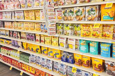
As shopper habits evolve, categories become more competitive and brands fight for attention across supermarket shelves, retailer apps, search results and social platforms, it’s tempting to assume the answer is a new louder, more disruptive look.
That may well be the outcome. But before changing the logo or debating colour palettes, brands need to be clear about the problem they are trying to solve. And when we shift the task of packaging from just standing out to helping people buy, we arguably get to a clearer challenge.
Sometimes that means change, and sometimes it means restraint.
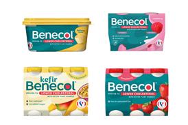
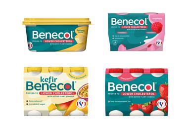
Sometimes the fundamentals are still doing their job. The brand stands for the right thing, but its expression has become dated or harder to navigate. That’s when a refresh makes sense. A good refresh removes friction, making the brand easier to find, recognise and choose.
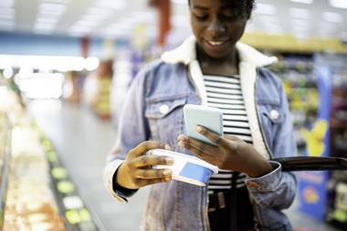
Better hierarchy, clearer typography and stronger pack architecture can make the difference between being chosen and being overlooked. This is particularly the case as brands have to perform just as well on an e-commerce thumbnail, where shrunken packs and cluttered search results leave even less room for hesitation, as they do on a supermarket shelf.
But focusing on how we help people to buy, rather than how we disrupt, also ensures we don’t overlook the importance of the equity we have already built. We spend seconds on our decision-making when standing in front of the shelf. Therefore, if changes make it harder to find our favourites, without significant advertising spend, then proceed with caution.
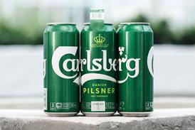
Recognition remains one of grocery’s most valuable commercial assets. Colour, typography, pack shape and other distinctive cues are often doing the selling before anyone has read a word on pack.
This is not a caution against change: it’s more about making sure the change has a reason.
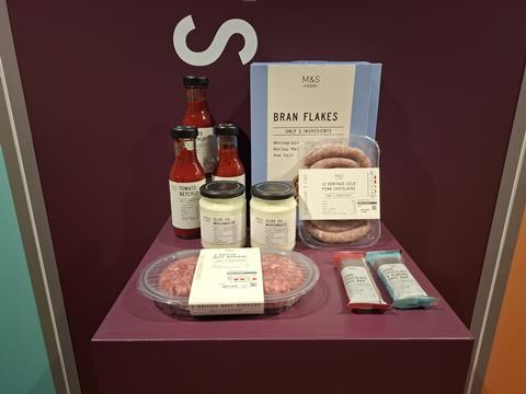
Other times, helping people buy is achieved via clearly communicating your position versus the rest of the category. Take M&S’ Only range, where the packaging communicates a clear story about minimal ingredients and pushes against heavily processed food. Or new entrants like Nuud or Fhirst, whose packaging was designed to not simply compete within their categories, but redefine them.
They reframed the sectors they were entering and redefined their enemies, using brand as a strategic tool rather than a surface treatment. This isn’t just difference for difference’s sake – the packaging tells the story of the brand’s position in the category.
With growing pressure to stand out on the physical and digital shelf, fmcg is at risk of placing all emphasis on design that disrupts, rather than starting with how the breadth of ways design can help people to buy. Get that diagnosis right and the design decision becomes much clearer. Get it wrong, and you risk losing customers and your position on the shelf.
Kathryn Jubrail is a partner at Mother Design


No comments yet