Ocado is to rebrand its own-label packaging range in the coming months, according to an internal presentation to key staff seen by The Grocer.
The online grocer confirmed the brand overhaul was happening, revealing it would apply to “each and every one of our own-label products”.
Also revealed in the presentation was plans to change driver uniforms in autumn from the current light grey and green jackets to hooded black tops with a purple trim.
The packaging redesign plan comes after Ocado changed its website and logo from green to purple last month. One of the reasons for the overhaul was to better distinguish Ocado’s branding from that of rival supermarkets, giving it “a distinctive, ownable identity”. “Green is widely used in grocery branding in the UK, and frankly, we hate to be mistaken for anyone else,” the company said at the time.
The Ocado own-label range pack design was introduced in 2010, and revised a year later by agency JKR. Another extensive packaging redesign took place in 2016, by agency Pure, which can be seen across products currently displayed on the site.

The planned new packaging look is part of JKR’s complete brand overhaul – which covers Ocado’s logo, font, colour, website, vans and uniform.
As is common in e-commerce, two versions of the packaging for each product are being created, one solely for online display, and another for the physical pack.
“We are busy working on a new look and feel to the Ocado own-label brand and can’t wait to share the final result with our customers this spring,” said Ocado head of own brand Rachel Cox-Reynolds.
The entire own-label range would carry the “new look” she added, “but will continue to deliver the same reliable Ocado quality at the same great price”.
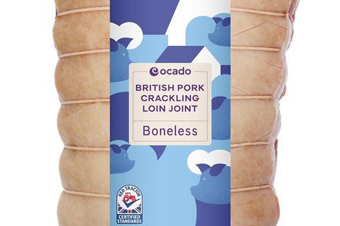
The first rebranded product was quietly listed on the Ocado site this week: British pork crackling loin joint.
Lois Blackhurst, executive creative director at STB Graphic Designers described the redesign as “weak and apologetic”.
“It’s missed a trick,” she said. “This was a chance to play to its strengths: as an online-only supermarket, it bypasses the need to stand out on crowded shelves and can focus its efforts on online impact. So I’m surprised Ocado has not been bolder. The logos and product information feel weak and apologetic, forming part of a very structured design that feels far too basic. An online-only store should surely be blazing the trail.
“While the abstract, graphic pattern approach may become an ownable part of the Ocado style it simply isn’t enough to salvage the redesign in my opinion. Whilst undoubtably eye-catching, depicting ingredients in such an abstract way doesn’t deliver the additional food cues or information that many consumers look for at the point of purchase,” Blackhurst added.







No comments yet