Close menu
- Home
- Retail & Wholesale
-
Products & Suppliers
- Back to parent navigation item
- Products & Suppliers
-
Product Categories:
- Back to parent navigation item
- Product Categories:
- Alcoholic drinks
- Bakery
- Cereals & breakfast
- Cheese
- Chicken & poultry
- Chocolate
- Confectionery
- Crisps, nuts & snacks
- Dairy
- Fish
- Fresh produce
- Frozen
- Household
- Meat
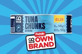
- Own Label
- Sauces & condiments
- Seasonal
- Soft drinks
- Vaping
- Vegan & plant-based
- World foods
- Suppliers
- People
- Reports & Data
-
Topics A-Z
- Back to parent navigation item
- Topics A-Z
-
Popular topics:
- Back to parent navigation item
- Popular topics:
- Cost of living crisis
- Crime
- Deposit Return Schemes
- Finance
- Government & Regulation
- Health
- Inflation
- Loyalty
- Marketing
- Mergers & Acquisitions
- New Product Development
- Sourcing
- Supply chain
- Sustainability & environment
- Technology
- Ultra Processed Foods
- Vaping
- A-Z all topics
- Content by type:
- Events
- Ask iA (beta)
- Subscribe now


The team and I are irregular soup eaters. This means we cons
2001-09-22T00:00:00
The brands we favour are New Covent Garden Soup (undoubtedly the most available and tastiest fresh soup about) and Baxters because it's posher than Heinz. The Baxters packaging suggests an indulgent, single serve, ethnic soup. We're not sure...
Already have an account? Sign in here
Already have an account? Sign in here
You’ve used up your article allowance