


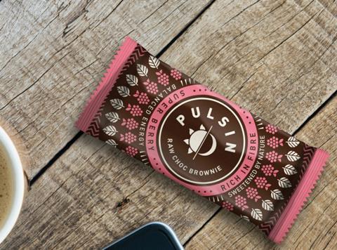
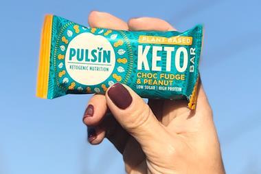
Protein powder supplier Pulsin is celebrating its 10th anniversary with an overhaul to its logo and packaging – in what the brand says is the biggest change in its history.
The new logo features a sun and moon, meant to represent “sustained, natural energy throughout the day and night”, and highlights Pulsin’s ambition to help consumers avoid “the unnatural highs and lows of nutritionally unbalanced, sugar-filled foods”.
Created with brand consultancy The Space Creative, the refreshed packaging brings together geometric and “intricate” designs, with each product allotted its own colour to make at-a-glance shopping easier.
To promote the rebrand, Pulsin – which specialises in protein powders and bars – will take over a window of Whole Foods’ flagship store on Kensington High Street next month. The change was influenced by the desire to reach a wider audience and transform protein products into everyday healthy snacks for all consumers, not just fitness enthusiasts, said Pulsin.
It now fully reflected “what Pulsin is all about – providing people with quality, balanced energy 24/7 to help get them through their days” said the brand’s marketing manager Steff Parker.
“Consumers are faced with more choice than ever when it comes to healthy snacking, but they often don’t have the time or the energy to read label after label to see if what’s on offer is as healthy as it claims to be.”


No comments yet