

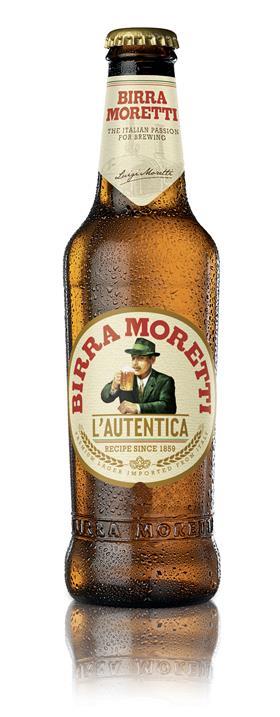
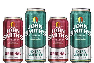
Heineken is rolling out a fresh look for Italian lager Birra Moretti.
The new bottle retains the shape of its predecessor but features a matt circular label, a retro, blocky typeface for the brand name, and the wording ‘L’Autentica’ (The Authentic). Heineken said the redesign – which comes as sales have risen a fifth to £12.4m [Nielsen 52 w/e 25 April 2015] - was intended to communicate the brand’s Italian heritage.
“The world beer category has seen huge growth in the past year, which shows the changing tastes of consumers,” said Heineken premium brand director David Lette. “Birra Moretti’s exceptional performance within this is a testament to its commitment to quality and the use of the traditional recipe in the brewing process.
“The new packaging showcases what we are most proud of, the beer’s deep-rooted Italian heritage, in an authentic yet stylish design that showcases the product’s premium nature and which will increase visibility on shelf and drive sales further.”
The Moretti Gran Tour, a food festival featuring some of the UK’s leading Italian food vendors, kicks off tomorrow in London. It will visit Leeds and Edinburgh later in the summer.
Pilsner Urquell and Marston’s Pedigree have both rolled out new looks this year to increase emphasis on their heritage and tradition.


No comments yet