


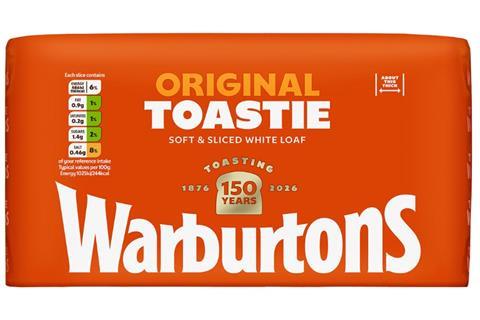
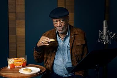
Warburtons is to celebrate its 150-year anniversary with a “bold” packaging refresh.
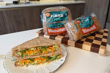
Developed in partnership with Bristol-based design agency Taxi Studio, the new look features Warburton’s “baked orange” hue across its 70-plus product range.
The British bakery giant said the intention was to unite its portfolio under a “powerful, cohesive visual identity” to create a dominant “wall of brand”.
This would make its products “unmissable on shelf” and simplify shopper navigation, it added.
Meanwhile the Warburtons wordmark has been tweaked to incorporate an upward curve, said to evoke a smile that “reinforces the warmth and togetherness the brand is known for”.
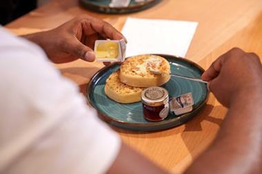
Toastable products, including crumpets and loaves, now feature a ‘Toasting 150 Years’ logo, while other bakery items sport Jonathan Warburton’s signature as a “proud testament to the brand’s heritage and unwavering commitment to quality and craft”.
The new packaging is rolling out now, with full distribution expected later in the year.
“As we celebrate 150 years of baking excellence, this bold new packaging marks a pivotal moment for Warburtons,” said chairman Jonathan Warburton.
“It’s a powerful visual statement that reinforces our position as Britain’s favourite family bakery. For our retail partners, this means unrivalled presence on shelf, streamlined navigation for shoppers, and a powerful system built to drive accelerated and sustained category growth.
“We’re incredibly excited for consumers to see this new look, which embodies the warmth, quality, and consistency Warburtons is known for, and sets us up for another 150 years of success.”
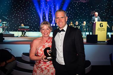
Warburtons was recognised as ‘Supplier of the Year’ at The Grocer Gold Awards last year after sales topped £1bn for the first time in 2024 [NIQ 52 w/e 31 December 2024].


No comments yet