


Who’d be an unaffiliated independent? While the multiples’ c-store estates grew 7.8% last year, the number of unaffiliated retailers slumped 4.5% as 906 shut up altogether or joined symbol groups [Grocery Retail Structure 2012].
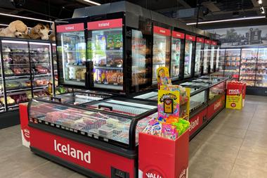
With the economic outlook showing no signs of improving, things are only going to get tougher - especially now the likes of Waitrose, Morrisons and Asda have thrown their hats into the c-store ring (with Little Waitrose, M-local and forecourt stores respectively).
So how can independent retailers - too often operatincostcug under tired-looking fascias - stand up to the slick operations of such formidable rivals?
Well for a start, they can join a symbol group. This is the one part of the independent sector that’s bucking the trend. But adopting a symbol group fascia and enjoying all the benefits membership entails will only get you so far. Retailers need to adapt the fascia to their specific needs rather than just blindly adopting it and expecting the cash to roll in.
The question is: just how adaptable are symbol group fascias? We asked retail branding agency M Worldwide to go back to the drawing board to redesign the Spar, Londis and Premier fascias. Their brief was to explore how the look and feel of these fascias could be adapted to better communicate the values of the retailer as well as the symbol group.
“The view has been ‘stick a fascia up, put vinyl on the window and away we go’. That’s not enough”
David Martin, M Worldwide
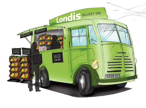
As you can see from the agency’s comments and proposals over the next five pages, it came up with some striking concepts - not least the delivery van-cum-mobile c-store, which appears to owe more of a debt to the current street food craze than the mobile library of yore. However, it also highlights how predominant the cookie-cutter approach still is despite all the talk of tiering fascias to suit different demographics and giving retailers greater scope to put their stamp on stores.
Symbol groups and retailers should be working much harder to customise their fascias if they want to meet the needs of an ever-more demanding consumer, believes David Martin, joint MD of M Worldwide. “With most of these symbol brands, the treatment to date has been lowest common denominator - basically it’s been ‘let’s stick a fascia up and put some vinyl on the window and away we go’ - that’s just not enough,” he says. “Increasingly consumers are looking for things that are less ubiquitous and corporate and more individual. Independents should be taking advantage of this trend.”
In short, they should be playing to their strengths. That means ending the love affair with bland vinyl -coated windows and generic photographs of produce, and decluttering their façades, argues Martin.
“Pictures of fresh food aren’t going to fool anyone,” he says. “If they say they’re brilliant at fresh food, as Spar does, then they need to show consumers their produce, not just what look like generic library photographs. All the symbol groups talk about being part of the community and being family run. Well, you don’t just ‘talk’ community, you ‘do’ community. They all need to work harder in this respect.”
Putting the name of the shopkeeper above the door is no longer sufficient. In M Worldwide’s vision of how Londis, which claims it offers a “community-based alternative to the multiples”, could reinvent itself, delivery services are advertised outside the store, locally produced and grown goods are on display outside the store, and postal services, eBay Lockers and other facilities required by any modern community are prominently advertised on the store front. That’s how you ‘do community’, contends Martin.
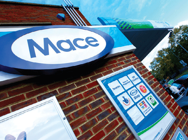
Better still, it’s how you get one over on the multiples, says Rory Brick, head of symbol for Palmer and Harvey’s Mace group. “Where the multiples can’t touch the symbol groups and independents is around the issue of being part of the local community,” he says.
“To date, the symbol groups have tended to follow the multiples’ approach in terms of fascia design and just expected the results to follow. But using the language of the multiples could easily disenfranchise customers who want to believe their local independent retailers and the provenance they can give, which the multiples just can’t. “
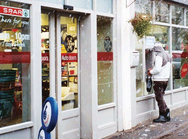
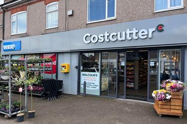
Ian Bishop, group marketing director at Costcutter, agrees. “Communicating that local message is absolutely key,” he says, pointing to to the many references to localism in the language and images used in the myCostcutter fascia - first raised above a shop in Insch, Aberdeenshire, last July and now featuring on the hoardings of five stores, and counting.
Flexible toolkits
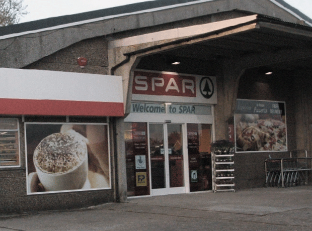
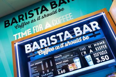
Providing a meeting place - along with a good coffee or even a pizza - underscores the whole community message, says Martin. As with all three of the redesigned fascias, Spar’s windows are kept clear in order to showcase what’s inside. In Spar’s case, this includes a pizzeria and café, a range of foods from around the word to underscore the chain’s global heritage and a cosmopolitan name: The Italian Connection. Such measures are clearly not going to be a hit in every area, but this proves the point: retailers need to adapt their offer to local tastes.
The good news is that M Worldwide’s vision is not that far removed from reality for some Spar retailers. Take the award-winning Walthamstow Village Stores in East London. “We have a takeaway pizzeria, bakery and patisserie, which really helps create a sense of community and a buzz in the store when people are waiting for their food and talking,” says co-owner James Brundle.
The store, which operates under a bespoke grey fascia co-developed by Brundle’s architects and the Spar design team, is also an oft-cited example of what can be achieved when the cookie-cutter approach is abandoned and proves that one size shouldn’t be made to fit all.
Martin suggests symbol groups should allow more retailers to take a leaf out Brundle’s book and play with the way their store looks so that it expresses the retailer’s inviduality and the store’s location as well as the brand values of the symbol group.
“There needs to be a much more sensitive treatment of how the shop front looks to make sure it is an enhancement to the local high street it is on,” he elaborates. “It’s not just a case of painting the world red or green. There needs to be a flexible toolkit for these guys to fine-tune their stores look to local markets.”
After all, these are the people who are best placed to understand what their local community store should look like. Yet while some symbol groups have allowed, even encouraged, members to put their own stamp on their fascia, the likes of Walthamstow Village Stores remain very much in the minority. That needs to change, says Martin.
“There’s more potential for the people who run these stores to determine how their stores look,” he argues. “At the moment, they are using a borrowed language from the multiples without playing to their strengths. Retailers and symbol groups need to free themselves from the idea that everything needs to be the same.”
That is not to say the symbol groups should leave everything to the retailer. “The important thing is there needs to be controls on this by the symbol groups,” says Martin. “Retailers need a framework in which they can operate at a local level and express themselves, but there do need to be quality controls.”
Pure convenience
This is especially true of some of the larger convenience stores that have the scope to veer radically from the blueprint. Where there is arguably less of an issue is with the pure convenience offers of smaller CTN stores, but there are still plenty of subtle modifications and improvements they can make. Their primary goal should be to simplify the message and focus on the fundamentals, believes Martin.
“Essentially, Premier is a pure convenience offer: it’s all about being in the right place at the right time. What we want is to enable them to square up to the big convenience chains,” he says. “We can do that by decluttering those windows and really focusing on their core message, which is price and convenience. They need to make their opening hours prominent and feature a selection of promotions, not throw everything at the store front and hope something sticks. They need to be more sophisticated.”
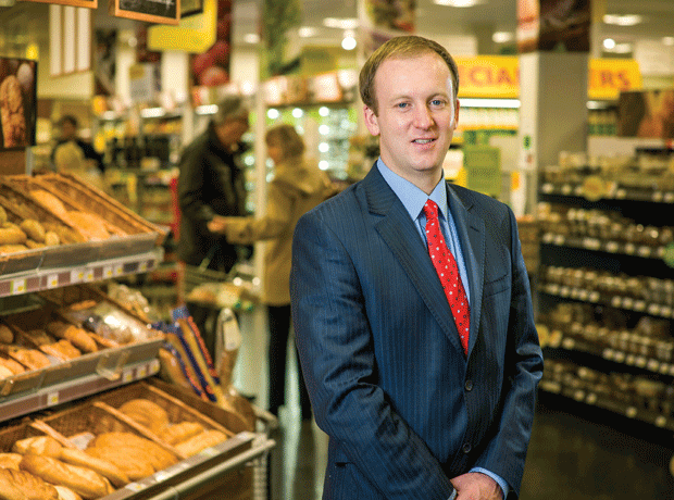
Booker, which owns the Premier and Premier Express brands, concedes that the time has come for a new look for the group, which is the biggest in terms of membership. Head of Premier Martin Swadling says the fascia is being redesigned and promises news on this in coming weeks. He adds that technology similar to the 24-hour digital vending machine shown in M Worldwide’s redesign sketches could play an increasingly important role in store front designs in the future.
“There will be greater use of digital technology in the future, allowing you to change your store imagery at the press if a button,” predicts Swadling. “However, the basics of clean, bright and inviting will always apply. The exterior should always be clean, bright, bold, eye-catching and well-lit at night - a reflection of what the customer should expect to find in store.”
Retailers and symbol groups should also look outside their particular boxes for inspiration. Martin suggests that players like Premier could learn a lot from convenience players based in train stations and airports, such as the French retailer Relay and the UK’s Whistlestop Food & wine.
“Relay has really got that CTN proposition nailed down, with great execution and presentation,” says Martin. “Both Relay and Whistlestop have clean, uncluttered stores, which allow people to find what they want quickly and be on their way.”
Retailers should also take advantage of the greater choice in formats now on offer. Over the past couple of years, several symbol groups have started tiering their fascias to suit a range of demographics, from council estates to the leafy suburbs.
Costcutter now offers its retailers three formats - the reinvented Kwiksave at the value end of the spectrum in red and white livery, the standard white Costcutter in the mid-market and the premium black green myCostcutter for more affluent areas. Others, including Scotmid Co-op and wholesaler Parfetts, are also developing multiple fascias.
Right products, right price
However, not everyone is convinced bythe strategy’s merits. “At Premier, we don’t try to tailor our fascias to one demographic as shoppers are so transient these days,” says Swadling. “Shopper habits have changed so much in recent years. Just look at how many BMWs and Range Rovers are parked outside Aldi these days.”
What happens if the affluence of an area changes, questions P&H’s Brick. “The benefit is that it makes it easier for symbol groups to segment their estates and potentially put in different price structures and deals depending on the demographics of an area,” he says. “But things can change - if you have a store that’s servicing an affluent community and for whatever economic reason that changes, you may have to invest in a new fascia.”
Even if the fascia is suited to the local demographic, only part of the battle has been won. “It also comes down to the range of services and goods on offer in-store,” says Bishop. “Price is important but it’s not the main thing. It’s more about getting in the store, getting what you want easily, being served courteously and wanting to come back again. The store in Aberdeenshire was turning over £18,000 a week, now [since it converted to the myCostcutter fascia] it’s at around £36,000 a week. And that’s a store with immense competition.”
This store has succeeded in standing up to that competion - and out from the crowd. Not everyone that changes their fascia will be able to double their sales, of course, but the right fascia can clearly make a massive difference.
It’s no longer just a matter of getting the basics right, adds Martin. “Of course there are hygiene factors that retailers need to pay attention to like visibility, cleanliness and decent merchandising at play here, but what else can they do?” he says . “They can act to differentiate themselves from the competition. Everyone is driving to that same bit of space and eventually people are just going to go up the road to the Sainsbury’s Local if independents don’t act.”
If they do take the experts’ advice and play to their community strengths, the days of a one-size-fits-all approach to fascias could well be numbered.
Back to the drawing board
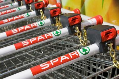
Spar
They say: “Members retain their independence but enjoy advantages of belonging to a global brand.
Values: global heritage, a showcase for fresh food, convenient products, passionate local owners
Verdict:
- Spar says it is brilliant at fresh and has global heritage. Could this fascia communicate these ideals more clearly? Yes!
- It shouldn’t be about painting the whole world red and green. The fascia should be flexible and less corporate, allowing independents to communicate who they are!
- If it’s about fresh food people want to see fresh food. Not photos of fresh food!
- The real impact should come from what’s on the other side of the window, not lighting and vinyl

Solution:
- Less ‘corporate’ approach
- Communicates global heritage though twinning
- Draws on Spar heritage and global knowledge
- Clear views into store to see products and people
- Real product, not pictures of product
- Flexible shop front opens up to connect with the street
- Uses food market, food to go and foodservice cues
- Extensive kit of parts to allow more individual & locally ‘tuned’ solutions
- Materials & finishes palette more neutral, natural & textural to support food offer
Back to the drawing board
Londis
They say: “Community food retailing associated with trust, quality, value and innovation remains at the heart of our development strategy.”
Values: friendly service, flexible opening hours, fresh products
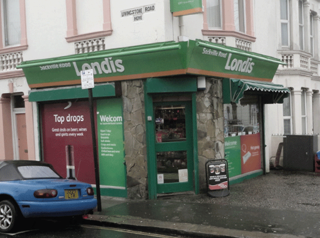
Verdict:
- Londis talks about being part of the community and uses the family angle. Some of the things it says are great and resonate with other trends. It’s just often let down at the executional stage
- What’s with all the vinyl? They need to open up the windows and show us what’s inside to make us want to come in
- Convenience is about providing the right product at the right time. Yet their opening hours are not prominently displayed on the shop exterior
- Londis states that fresh produce is a value. We should be able to see some on show!

Solution:
- Make more of services such as Amazon lockers, click & collect, Post Office, ATM, etc
- It has to be somewhere people feel comfortable spending time in
- Fresh produce should be on display
- Community retailers should have flexibility to adapt fascias to their areas
- Community retail shouldn’t end at the shop front. Delivery services can be valuable. And what about a mobile shop?
- Shop front needs to be welcoming
- Handwritten signs showing great deals feel less corporate
Back to the drawing board
Premier
They say: “We offer you the very best value in convenience products combined with the personality and entrepreneurial spirit of the independent retailer.”
Values: value, convenience, availability
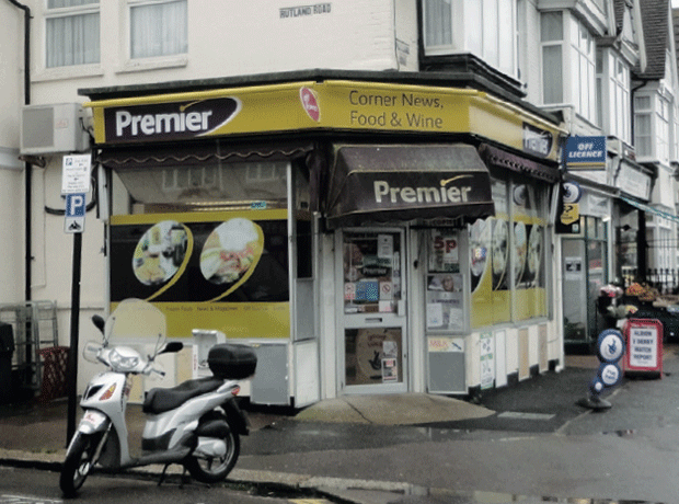
Verdict:
- Premier says it is about doing pure convenience brilliantly, about being able to find what you need quickly and be on your way
- It is in serious danger of cluttering up its window and diluting its message with all these images. Need to keep it simple!
- Is fresh food Premier’s core message? It’s great that they sell it but it’s got a way to go before it’s a convincing offer
- When are they open?
- Regardless of whether you like purple and yellow, the colour scheme does stand out on the high street. But could it be tweaked to convey a more quality message?
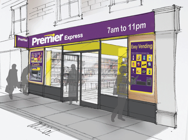
Solution:
- Convenience needs to be at the core of the shop design
- Internally illuminated white 3D letters help the store stand out from the competition
- Convenient 24hr availability through digital vending
- Convenient service such as ATM cash services, top-up, bill payments, etc
- Digital screen with deals of the day helps to declutter the window
- Ordered and disciplined merchandising and promotion
- Clear message about availability and offer
- Using language of the multiples, but not overusing!
- Aubergine fascia in simple bold colour, which has standout with quality feel. Clean, clear and open shop front
The future of fascias?

For every spotty youth Sainsbury’s employs in a c-store, how many independent retailers go bust?…
- 1
 Currently
reading
Currently
reading
Fascia to fascia: how symbols could sharpen their act
- 3
- 4
- 5


No comments yet