


Halo Top made its debut in 2012, but it wasn’t until three years later that sales really took off, thanks to a pack redesign that has since sparked a raft of imitators
In 2015, ice cream underwent a sea change. Halo Top got a makeover, paving its way to becoming not just a grocery sensation but also a style icon.
A brighter, simpler look saw sales surge and lookalikes emerge – not least in the UK, where a slew of Halo Top-alikes from brands and retailers continues to roll out to grocery as shoppers’ demand for salubrious ice cream soars.
So how did Halo Top arrive at its iconic design? And why has it proved so attractive to imitators?
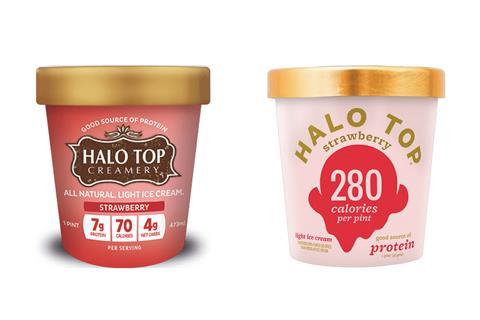
Halo Top hit US stores in mid-2012 with a more ‘fussy’ design than is now so familiar. Its logo was quite elaborate and took prominence over the front-of-pack nutritional information, which was per serving.
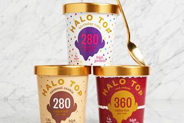
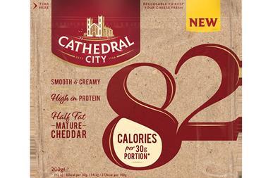
Three years later, the disruptive Californian brand sought both greater standout in packed freezers and more prominence for its healthier eating credentials – its calories being between 240 to 360 per pint, while its protein was at least 20g.
Halo Top’s tubs “needed to remain fun, fresh and youthful while capitalising on the healthful characteristics of the product” founder Justin Woolverton told Brand Packaging magazine.
The biggest design decision was whether to highlight calories or protein. Calories won. “That number was just too strong of a point, and it also allowed us to show a per-pint serving instead of a per half cup serving,” Woolverton said.
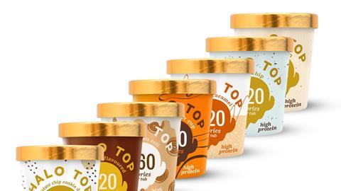
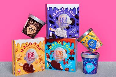
The new design featured: a simpler logo, brighter colours, a shinier gold lid, clearer messaging and – front and centre in big, bold digits – the kcals per pack. That did the trick: following the overhaul, Halo Top’s growth accelerated, with sales surging to $50m in 2016, according to Inc magazine.
Captivating
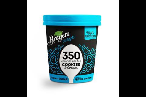
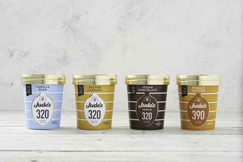
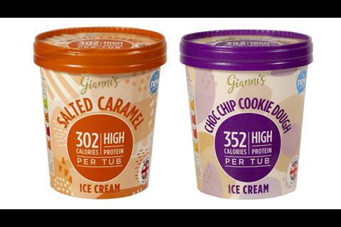
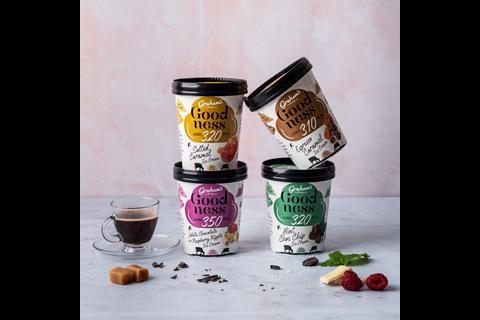
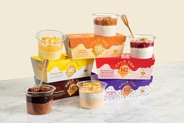
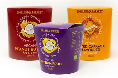
Since its UK debut in January 2018, Halo Top’s good looks have captivated the British ice cream category, which has seen the likes of Breyers Delights, Jude’s, Graham’s The Family Dairy, the mults and the discounters take some or other degree of design inspiration for their own better-for-you ice creams (see our gallery below).
Each has made use one or more of Halo Top’s main front-of-pack elements:
- Calorie count as focal point
- Central shape surrounding the kcals
- Bold, sans-serif typography
- Bright, simple colour
- Protein claim
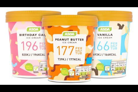
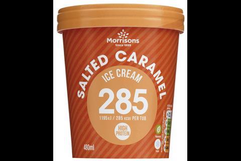
One of the most recent examples of Halo Top’s effect on ice cream’s aesthetics was in the form of Morrisons’ new range, with its familiar hues and attention-grabbing calorie counts. It came after Halo Top had racked up £22.2m of grocery sales in its first year in the UK.
The brand’s success comes from embracing the zeitgeist and being “loud and proud” a permissible treat, says Howard Wright, senior creative & strategy director at design agency Equator.
“It’s not an awful lot different from when Maltesers talked about the amount of calories in a pack; it’s just Halo Top has gone front and centre.”
The US ice cream brand hit upon “what’s currently important to consumers” he adds. “The calorie count has become almost the identity of the product – which had never been done before.”
In fact, shoppers “are no longer interested in a brand name” says Richard Horwell, managing director of Brand Relations. They want to know about a product’s benefits. “So brands now shout the calories, vegan, plant-based, low fat, etc – and the brand name takes back stage. Whereas this is great for consumers, it isn’t good for brands as it leaves the door wide open for own label.”
Copycats
The raft of copycats inspired by Halo Top is an example of what happens when “the first entrant design-wise becomes the ‘convention norm’” according to The Brand Nursery director James Acton.
“If you’re doing super-low calorie ice cream then the calories per tub are going to be massive and all over the pack. You can’t really get away from that as a designer and, as such, you see a dearth of what some people call ‘copycat’ or ‘me-too’ designs.”
But Acton doesn’t call them that. To him, the Halo Top design is a necessity for driving ice cream’s buoyant healthier sub-sector. “It’s a communication protocol that we will see time and time again as it is the main differentiator between ‘fat’ ice cream and ‘low fat’ ice cream.
“As for competition and making the category unnavigable, competition is good. It’s good for the consumer, and it’s good for design consultancies as it makes us think harder about the challenge to differentiate.”
The investment parlour: ice cream category report 2019
It’s not so good for shoppers focused on taste over health, warns Karen Green, director of Food Mentor. Too many of the Halo Top-alikes “look like they are an identikit of chemical formulations as opposed to delicious ice cream”.
Young Foodies’ Thea Alexander has similar reservations. Supermarkets’ ice cream segments risk becoming “a minefield” for punters seeking deliciousness, she warns.
“That’s why we see brands like Oppo, Wheyhey and Miiro making waves. Yes, they make their health claims on front of pack. However, first and foremost, they are brand-led and look (and are) delicious. It’s that difference between ‘healthy ice cream’ or ‘functional ice cream’ and ‘delicious ice cream that is also healthy’.”


No comments yet