


The utilitarian front cover design and title belies the salty fingered, dazzling delights within UK Crisp Packets 1970-2000 (Banger Books, £15).
The 140-page book presents a pictorial history of crisp packets, presented one pack per page without annotation; allowing readers to simply salivate at the artwork and rustle in nostalgia.
The contents represent the “incomplete collection of Chris Packet” who, the foreword by University of Brighton professor of visual and material culture Annebella Pollen notes, is an “informal archaeologist of these humble artefacts” which were picked up when Packet was graffitiing trains in dark tunnels.
Speaking to The Grocer, Packet says after finding four packets in “a hidden place forgotten by time” the collection grew and grew “by any means necessary: buy, swap, trade”.
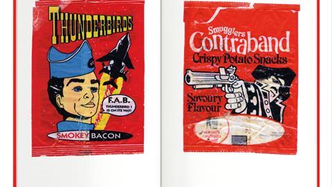
Some products that feature are long gone. Take Bensons Mammoth Bites, ‘vitamin enriched’ sausage and tomato flavour corn snacks. Or Smugglers Contraband Savoury Flavour, the packaging of which features a pirate pointing a blunderbuss at the purchaser.
There are countless licensing deals on display too – including Teenage Mutant Hero Turtles (“Radical rations for cool dudes,” the packet shouts), Thunderbirds and Wallace & Gromit.
The book can’t help but highlight that something has probably been lost in snack packaging design. These packets past are far punchier than anything found on the supermarket shelf today. The tome ends in 2000, Packet says, due to the reign of computer aided design: the moment “designs lost their edge and stylistic flair”.
A must-have volume that can be briskly scoffed or slowly savoured.
The Grocer interviewed the book’s author Chris Packet on his collection, motives and take on modern packaging design…
Why crisp packets? What about them inspired you to collect and compile them in this way?
It’s something people can relate to. Classic UK ephemera: everyone ate them as a kid, and they probably still do now. Collecting an item that you usually only have in your hands for a matter of minutes, puts them into a slightly different context. Preserving something that is disposable and worth nothing, gives it a new value.
What is the source of all the featured packets?
I collect by any means necessary: buy, swap, trade. I’ve been gifted packs that friends have held on to since childhood and ones that have been found by friends whilst exploring abandoned places.
I found an initial four packets myself over the course of a few months, in a hidden place that had been forgotten by time. Historically, I didn’t collect as a kid, it’s something that has come to me as an adult. I allowed myself to indulge in collecting these as they don’t take much room to store, and don’t break the bank to buy.
What trends over time do you see in the designs?
Older packs have amazing graphics and lettering, often flanked by mascots or hand-drawn cartoon characters. The printing methods have also changed, so the look of the old ones is quite unique. In years past they would commission illustrators or comic book artists, who made some incredible and now classic designs. After more heavy use of computer-aided design in the early 2000s, for me the designs lost their edge and stylistic flair.
What are your favourites – design-wise and taste-wise?
My personal favourite is hard to call. I’m no connoisseur, but I do rank a few highly. If I had to choose it’s somewhere between Pickled Onion Monster Munch, Nice ‘n’ Spicy Nik Naks, Salt & Vinegar Discos or T Bone Steak Roysters.
My favourite packet for design is in the book: Walkers Snaps from the 1970s for the cartoon wizard dragon and fun bouncy lettering.
I prefer some of the 1970s and 1980s designs more as they use less colour, but bold graphics. Maybe it’s the simplicity that appeals to me.
What’s your view of present-day packet designs?
Nothing really catches my eye artistically and this results in me eating less crisps, I think. They all kind of look the same and lack originality and effort. Bring back hiring artists to do the concepts. They used to be more fun, had more crisps in and often did cool giveaways and competitions.
A good example on the loss of good design over a crisp packet history would be the modern Space Raiders alien head logo, compared to ones from the 1980s and 1990s where they were designed by the late, great British comic book artist: Brett Ewins, who did the Judge Dredd comics.
Might you do the same with another product’s packaging?
I’m working on a second crisp book, as the collection grows, likely out next Christmas. But in the future I’d like to release books on other collections, presented in a similar format.


No comments yet