When Lyle’s Golden Syrup unveiled the first major revamp of its branding in over 150 years earlier this week, the move sparked controversy
Its original Victorian-style tins – featuring an illustration of a dead lion swarmed by bees – made their debut in 1888. They were the brainchild of Scottish businessman Abram Lyle, an elder of St Michael’s Presbyterian Church in Greenock, whose strong religious beliefs influenced the design.
The logo on the tins depicted the story of Samson from the Old Testament, in which he kills an attacking lion “with his bare hands”, later noticing that a swarm of bees have formed a honeycomb in its carcase.
He states: “Out of the eater came forth meat and out of the strong came forth sweetness.”
The second half of the quote featured on the Lyle’s Golden Syrup logo, under the image of the lion. However, this week Lyle’s unveiled plans to drop the dead lion and slogan from its plastic syrup and dessert bottles, replacing them with a modernised illustration of a lion’s head. The tins will keep the original design.
Bringing Lyle’s into the modern day
According to Lyle’s brand director James Whiteley, the “fresh, contemporary design” of the squeezy bottles “brings Lyle’s into the modern day, appealing to the everyday British household while still feeling nostalgic and authentically Lyle’s”. But the move caused consternation among some public figures and Christian commentators.
Sam Margrave, a member of the General Synod, the Church of England’s legislative body, told the Telegraph: “There is nothing modern about ditching tradition or sidelining Christian messaging.
“I am sure the Lyle business doesn’t mind benefiting from sales and Christian branding every Easter, so why do they feel the need to eradicate their connection with their Christian founder’s iconic logo which tells a story that works for every generation?”
Meanwhile, author Colin Freeman posted on X: “This is what happens when brand managers get involved: take a story that has survived 2000 years and ‘refresh’ it (i.e. ditch it).”
I remember my mum explaining the story behind the lion on the Tate and Lyle syrup tins when I was a kid. Fascinating. This is what happens when brand managers get involved: take a story that has survived 2000 years and “refresh” it (ie ditch it).https://t.co/qpHlVr635k
— colin freeman (@colinfreeman99) February 21, 2024
Shoppers brand dead lion ‘horrid and unnecessary’
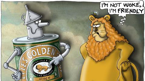
One shopper used X to complain that “Lyle’s Golden Syrup has gone woke!” However, most seemed unaware of the biblical link, having failed to notice the lion on pack was dead in the first place.
“The lion is dead? What? Who knew? I thought it was sleeping after some nice sweet food…” one shopper posted. Another wrote: “I never knew this,” while a third simply stated: “I quite like the new Lyle’s Golden Syrup packaging”.
Lyle’s Golden Syrup - The lion is dead? What? Who knew? I thought it was sleeping after some nice sweet food..
— richy roo 🇬🇧🇺🇦 (@richyroo73) February 21, 2024
Anecdotally, many shoppers don’t seem to like the idea of a dead lion featuring on their syrup. One shopper branded it “yucky” in an X post. Another called it “horrid and unnecessary”.
Since when is the lion dead ffs?!? I always read this as some colonial nostalgia of a lion dozing in the midday sun as flies/bees buzzed around. This whole dead-lion stuff is frankly horrid and unnecessary. Sleeping! Buzzing. Surely. 🐝 😴 😭
— Ian Jindal (@ianjindal) February 22, 2024
What’s clear is the logo has lost relevance for many non-Christians, which now make up the majority of Brits. Only 46.2% of the English and Welsh population said they were Christian in the last census, a decline of 13.1 percentage points since 2011 – let alone 1888.
Giving shoppers choice
Surely, heritage brands like Lyle’s shouldn’t be criticised for attempting to make their ranges more inclusive? After all, Whiteley’s explanation makes it clear the redesign was carried out with the best intentions; it is far less about “sidelining Christian messaging” than it is updating a Victorian brand for today’s grocery shopper.
It’s also worth stressing Whiteley’s point that Lyle’s will “continue to honour our original branding with the heritage tin”, which shoppers who prefer the old logo can continue to buy.
So, this week’s condemnation of a supplier that has made its best efforts to make sure every shopper feels included only goes to show how difficult it is to navigate a rebrand in fmcg.










No comments yet